

I recently ended an engagement with a client. Honestly, I am glad about it. It has opened up some buffer in my weeks, time I can now give to my health and my family. I am flexible, I am healthy, and the next stretch already feels more focused.
Clearing the space turned out to be the easy part. Deciding what gets it, when two things want the same hour, is harder.
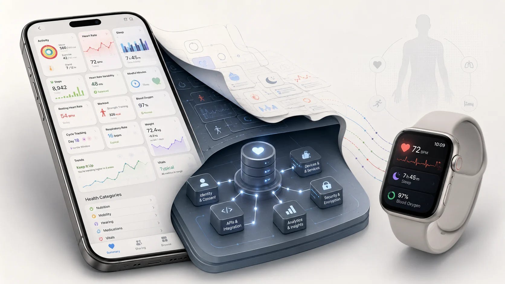
Apple Health has the same gap. You choose which sources may write to it. You do not get to choose which one wins.
Apple gives you a guest list, not a referee
A single heart rate metric can be written by several things at once. An Apple Watch. Nike Run Club. A Withings device. Whatever other fitness apps you have granted access to.
You do have control here. You can disable a third-party source and stop it contributing anything new. That part works, and it is the part everybody notices.
The gap opens when two sources you both trust disagree.
Go for a run with the Watch on your wrist and a running app recording at the same time. Both write heart rate for the same stretch of the same afternoon. Neither is broken. Neither is a third party you would want to switch off. One number ends up in your trend.
You cannot mark one device as more reliable than another. Apple does not explain how the final figure gets chosen. Two valid readings go in, one number comes out, and the reasoning is not available to you anywhere in the interface.
You can decide who is allowed into the room. You cannot decide who gets the last word once they are in it.
The simplification is defensible, and it still costs something
I do not think this is an oversight. A switch plus automatic merging is far easier to understand than a source ranking system.
Ranking means explaining precedence. Then ties. Then time windows. Then what happens when the preferred source is missing for a day, or writes the same value twice, or produces a reading that is clearly wrong.
Every one of those needs a rule, and every rule needs a sentence somewhere in an interface that most people would open once and never return to.
So Apple chose the version almost everyone can understand. That is a real reduction in complexity, and it leaves a real gap in the trust story.

Apple has spent a decade buying trust the slow way, one clinical study and one regulatory clearance at a time. That is expensive to build and very hard to copy. It sits slightly oddly next to a number whose origin the product will not tell you.
Which is the reason this gap is worth more attention than the complaint everybody actually makes. Apple Health’s whole position rests on trust. A cluttered Browse tab costs you a few seconds of hunting. A number you cannot account for costs you the thing the product is really selling.
Provenance becomes part of the number
When the data was step counts, none of this mattered much. Nobody needs an audit trail for a Tuesday walk.
The stakes move as the numbers do. Show a reading to a doctor, put it beside a medication decision, use it to decide whether to train today, and where it came from stops being trivia. At that point people need to know which source produced it and why the system preferred that one.
This is not an Apple problem. Any product that aggregates from several sources has it.
A CRM holding contact details from an email integration and an enrichment service. A finance app reading the same transaction through two bank connections. Analytics stitching one person together across two SDKs. In every case somebody wrote a merge rule. In most cases the customer cannot see it, and often nobody internally can name it either.
The pattern is consistent. Teams ship inclusion controls early, because permissions are easy to reason about and easy to draw. Arbitration shows up much later, usually the first time two trusted sources disagree in front of a customer who cares.
Two notes that sharpened this
A tidy diagram is where the risk hides. I traced one number through a health platform a while back. My weight is measured by a Withings scale, stored by Apple Health, then read out by Google Health. Three hops. The platform that looks like it understands me best is displaying a figure it never measured.
The exercise worth running is to mark every source in your product as yours, borrowed, or imported. Then ask what still works if a borrowed one shuts off tomorrow.
An option that exists is not the same as a choice that is equal. I was adjusting a consent flow that touches GDPR, and the question looked small. Which button style for accept, and which for decline. The design system answer is primary for accept and secondary for decline. Consistent and tidy.
The regulatory requirement is not that a decline option exists. It is that the choice is genuinely equal. Weight one of them visually and you are nudging, with a component library as the excuse. It is the same shape as the source switch. The control is present, and one layer too shallow.
Try this on your own product
List every place your product merges data from more than one source. For each one, write down what happens when two of them disagree, and whether a customer could find that answer without asking you.
Then sort your controls into two piles: the ones that decide who is allowed to contribute, and the ones that decide who wins. Most products have plenty of the first and none of the second.
You may well conclude, as Apple seems to have, that the second pile is not worth building. That is a fine answer. It is a much better answer when somebody has actually made it.
Also from me
A few other things I have written, outside the teardown.
Marvel looks expensive and feels weightless
Marvel spent $200 million on a film and it still looked like plastic.
Denis Villeneuve spent less and made you feel the weight of a sandworm from the inside of your chest. The difference wasn’t budget. It was perspective.
Someone broke down Villeneuve’s technique recently and it stuck with me. Three things he does consistently: he keeps a human figure in frame so you feel the scale by comparison, he moves the camera slowly, the way a person’s eyes actually move, and he blurs the background so your attention lands where a human’s would. Everything is filtered through a human body, a human nervous system.
Marvel does the opposite. Cameras fly through impossible CGI arcs, backgrounds are rendered in perfect sharpness, nothing is anchored to a person’s experience of being there. It looks expensive and feels weightless.
A lot of early-stage products have the Marvel problem. The team builds something technically impressive, the demo looks clean, but users bounce in the first two minutes. When I run a product audit, I often find the same pattern: the interface is designed from a system perspective, not a human one. Every feature is visible. Every option is available. Nothing is filtered by what a person actually needs in that moment, in that state of mind.
Villeneuve’s fix translates directly. Show one thing at a time. Anchor the experience to where the user is standing, not where your architecture lives. Let some things blur into the background until they’re needed.
The best onboarding flows I’ve worked on do exactly this. They don’t show users the whole product. They show users themselves, reflected back, with one clear next step.

They sounded like Claude
I was chatting with someone from an AI product team that lives inside Claude all day. Sharp person, good thinker. But there was something odd about how they explained things: the analogies they reached for, the rhythm of how they built an argument. It took me a while to place it.
They sounded like Claude.
Not in a bad way. The thinking was solid. But the communication style had quietly drifted toward something optimised for a tool, not for the humans around them.
Tools shape us. That is not new. But AI tools are shaping how we reason out loud, and that is faster and subtler than most people notice.
Worth checking occasionally: if people keep missing your point, the gap might not be their comprehension. It might be that your defaults have drifted somewhere unfamiliar.

The flexibility is load-bearing
My wife went on a ten-day silent meditation retreat. So I had the week: school runs, cooking, housework, swimming, piano lessons, art class, all of it.
I expected to be wrecked by day 3.
I wasn’t. I felt surprisingly loose. We finished a co-op video game together, watched Harry Potter on the weekend, and I didn’t feel like I was constantly dropping something.
The thing I kept coming back to: flexible work hours meant I was never fighting the clock. I could shift things around without that low-grade panic of being somewhere you shouldn’t be, doing something you didn’t plan for.
I don’t think I could sustain it indefinitely. But this week quietly reminded me why I built my work the way I did. The flexibility isn’t a perk. It’s load-bearing.

Where to next
The full Apple Health teardown is on the site, including why an app nobody ever chose to download sits at a 3.0 rating, and why that is not a design failure: bearliu.com/blog/apple-health-infrastructure-by-design
Where does your product quietly pick a winner between two sources? Hit reply and tell me. I read everything that comes back.

Hello, I’m Bear.
I’m a product designer in Auckland, New Zealand. Most of my work is as a Fractional Design Partner, which usually means being the design lead a small team cannot yet hire full time.
Design Decisions is where I take one product apart each week and write up the decisions behind it. I make videos and record a bilingual podcast for much the same reason. I like working things out in the open.
bearliu.com · the full teardown library, and what I do for teams
hi@bearliu.com · the old fashioned way, and I read every reply
linkedin.com/in/bearliu · where most of my English writing goes first
youtube.com/@Bearliu · a video is worth a thousand words
x.com/bearliu · shorter thoughts, as they happen