

Arc filtered out most of its users before they clicked anything, and both filters sit in a place every product has.

A story went round an old workplace of mine that one of Atlassian’s founders was an early Arc enthusiast, and had handed the team a long list of suggestions. I have no idea whether that part is true. What is on the record is that Atlassian later bought The Browser Company outright for $610 million, and that the browser they ship now is Dia, not Arc.
Almost every designer and engineer I know went through a period of loving Arc. That is the part I keep turning over. How does a browser that good, admired by exactly the people who care most about their tools, never get anywhere?
Arc was one of the best-looking browsers anyone has built, and it never reached the mainstream. Both of those facts have the same root, and it shows up before the first click.
The first filter is how it looks
Open Arc’s old website and ignore the words for a moment. The personality arrives immediately. Warm, soft, artistic, generous rounded corners, light animation, a slightly vintage handmade texture. Visually it belongs to the same family as Notion, Substack and Linktree.
Those products tend to appeal to creators and individual users, people who enjoy shaping and organising their digital lives.
The communities where Arc actually took hold looked nothing like that. They were engineers, designers, product managers, heavy knowledge workers who found it through technology media and colleagues. They cared about speed, keyboard shortcuts, multitasking, and whether a browser could survive a complicated professional workflow.
Visual design does not decide adoption on its own. It does answer one question within a few seconds, before anyone has understood a single feature.
Was this made for someone like me?
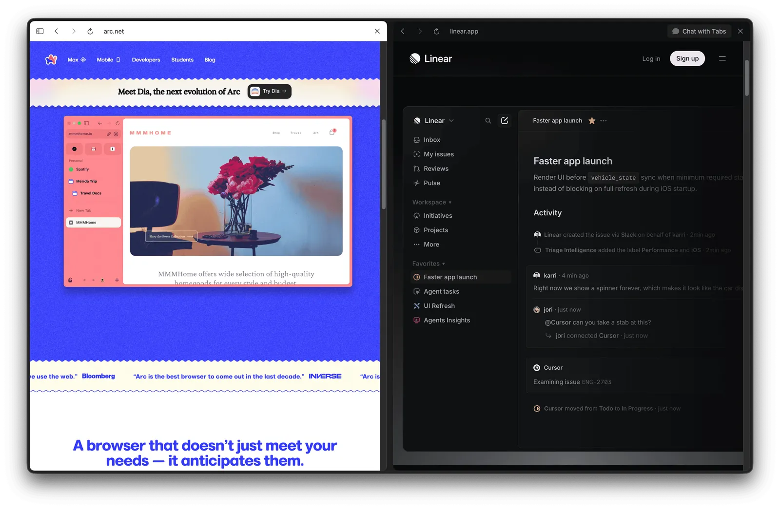
Linear is the useful contrast. Its interface is restrained, dense and deliberately cool, and it reads as a professional instrument. Roughly the same audience, an opposite invitation.
The second filter is how much you have to remember
A traditional browser asks you to understand two things: tabs and bookmarks.
Arc introduced Profile, Space, Folder, Easel, Boost, Tab, Command Bar and Pinned Tab.
From a designer’s point of view none of that was badly organised. Each concept had a clear purpose and the relationships between them were coherent. The information architecture was arguably elegant.
That is exactly the trap. A concept being understandable does not mean anyone wants to hold it in their head alongside seven others.
Spaces were one of Arc’s most important ideas: separate environments for work, personal life or a project, each with its own tabs and state. Genuinely useful for complicated workflows. By the team’s own figures, only about 5 to 12 per cent of users ever adopted multiple Spaces. Calendar Preview reached 0.4 per cent.

Years of differentiation never became part of most people’s behaviour.
Two notes that sharpened this
Most portfolios fail before the first scroll. Not because the work is weak, but because the presentation treats finished screens as the story when the decisions behind them are the story. Anyone reviewing at an early-stage company is not asking whether you shipped something. They are asking whether you can think through a problem and make a call. Polished screens do not answer that, and the same logic applies to a landing page.
A deadline teaches a tool faster than a tutorial does. I had seen the word “Skills” float past in articles for months and filed it under things to look into later. The moment I had a real friction point I wanted solved, the concept landed in about a minute. Concepts do not stick because they are explained well. They stick when someone needs them.
Try this on your own product
Two questions, and take them in order.
Look at your landing page with the copy blurred out. Who does the visual language invite, and is that the person who eventually pays you? Then count the invented concepts a new user meets in week one, and for each of them ask what it would take for that concept to be needed rather than learnt.
Anything that has to be memorised before it is needed is a bill you are sending before you have delivered anything.
Also from me
A few other things I have written, outside the teardown.
The portfolio gap is not about skill
Most designers I know are more capable than their portfolio suggests.
That gap is not about skill. It is about evidence. The work exists, the judgement is there, the taste is real. But nothing in the portfolio shows it, because the portfolio was last touched two years ago and the case studies read like project reports.
I have been thinking about this differently lately. A portfolio piece is less like documentation and more like a single by a musician. It is not a record of what happened. It is a made thing that carries your current thinking and taste, in a form someone else can actually hold.
The question is not “do I have enough projects to show?” It is whether anything you have made recently reflects who you are now.
For most of us, it does not. And the gap is smaller to close than we think.
A shopping street borrowed the London Underground
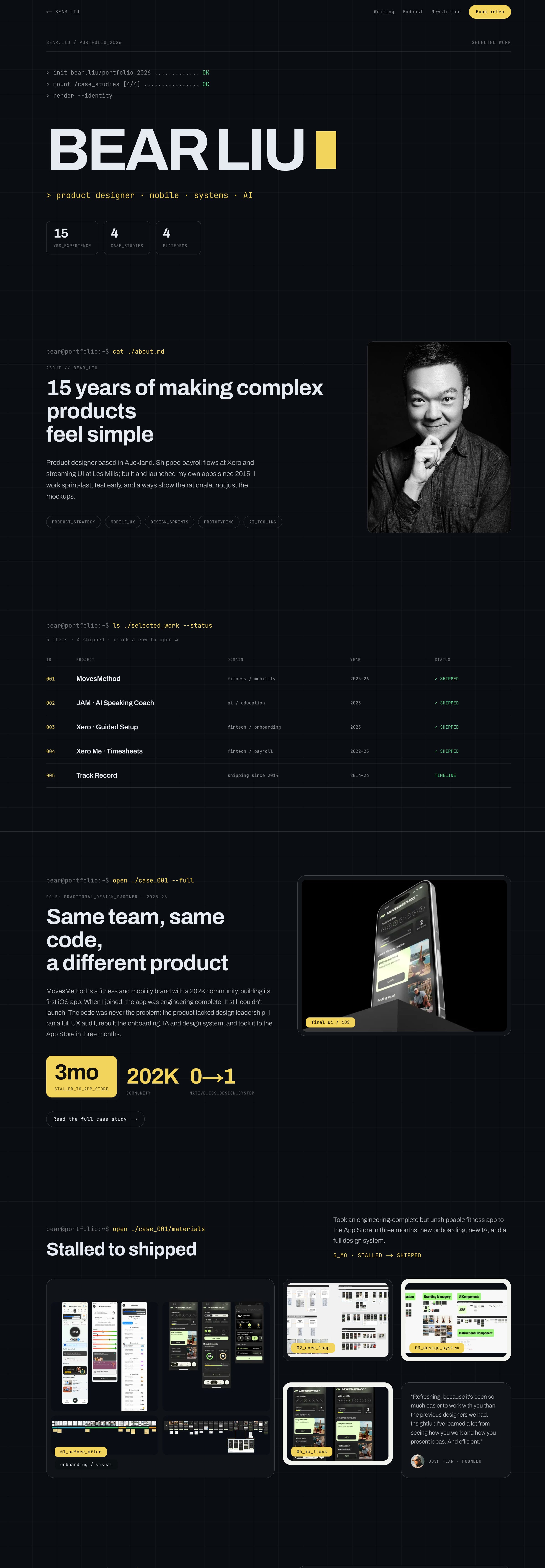
A shopping district in Tauranga is using the London Underground wayfinding system to direct people to shops. Not inspired by it. Literally adapted from it. And it works perfectly.
The London Underground visual language, designed in the early 20th century, has outlived nearly every design trend that followed it. Clear hierarchy, high contrast, consistent iconography, ruthless reduction of noise. It was built for one of the busiest transit systems in the world, where decisions need to happen in seconds under pressure.
That last part is the key. Good wayfinding design solves for cognitive load at the moment of decision. A shopper in a busy retail precinct faces the exact same problem as a commuter at Bank station: too much information, not enough time, one choice to make. The context is completely different. The problem is structurally identical.
This is the real test of a design system. Not whether it looks good in a controlled environment, but whether it still holds up when someone drags it into a context it was never meant for. The London Underground system passes that test every time someone borrows it.
There is a useful parallel here for product work. When you are designing onboarding flows, navigation, or any moment where a user needs to make a decision quickly, the question is not “what is the right pattern for this industry?” The question is “what is the cognitive load at this exact moment, and what does the user need to do next?” Answer that clearly, and you are probably already most of the way there.
The best design systems are not precious about their original context. They solve human problems, and human problems travel.
The bottleneck is finishing friction, not drawing skill
Hand-drawn diagrams are fast to make but painful to read. That friction was bothering me, so I ran a quick experiment.
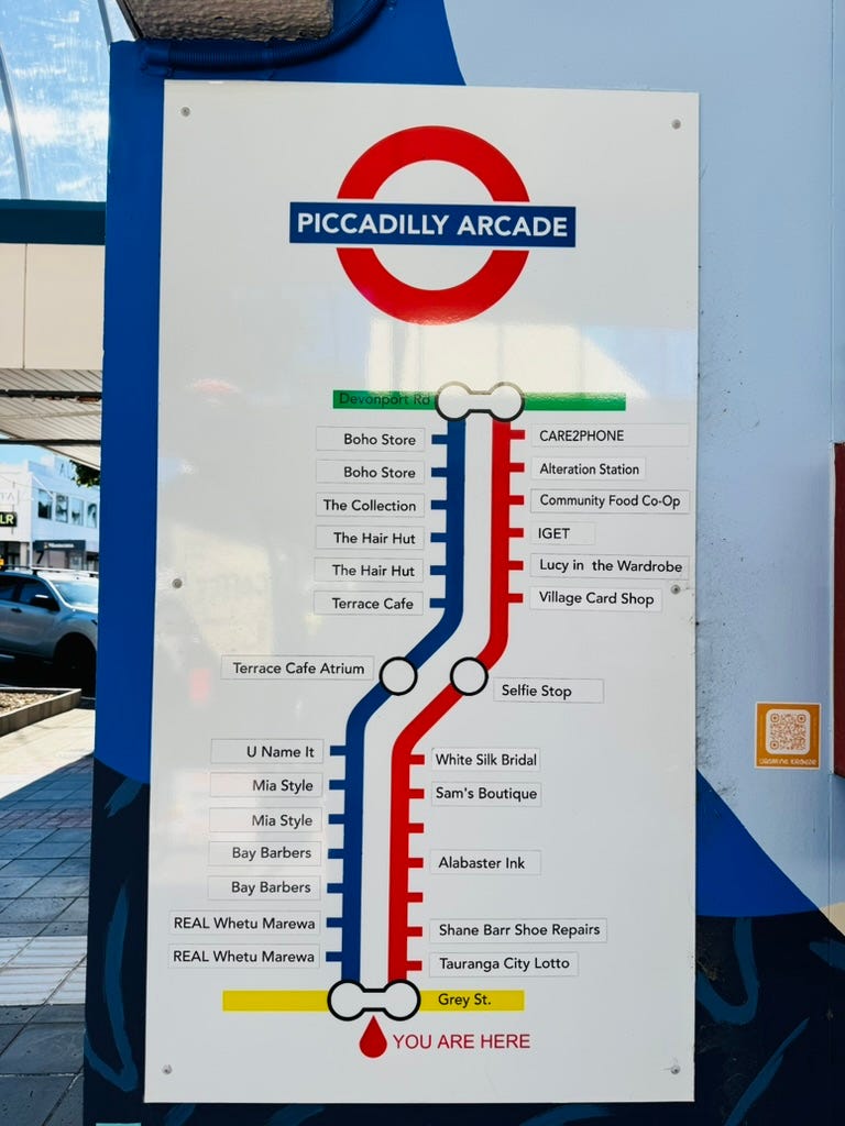
I’ve been using hand-drawn illustration comics to explain product concepts, the kind you sketch out in ten minutes to capture a thought before it disappears. The problem: rough lines and no colour make them harder to scan than they should be.
So I fed one into GPT’s image tool and asked it to clean up the line style and add simple colour. No anime transformation, no dramatic overhaul. Just enough polish to make the visual easier to follow at a glance.
The result was noticeably better. Lines read crisper, the hierarchy was clearer, and the whole thing felt more intentional without losing the hand-drawn energy that makes these feel approachable rather than corporate.
What I took from this: the bottleneck in quick visual communication isn’t always your drawing skill, it’s finishing friction. Most people abandon rough sketches before they publish them because the gap between “good enough to understand” and “good enough to share” feels too wide. A tool that closes that gap in two minutes changes the calculus on what’s worth making.
I’m not suggesting AI polish replaces good visual thinking. But for practitioners who sketch to think, not to impress, this kind of light post-processing is genuinely useful. It lowers the bar for shipping a visual explanation, which means more ideas actually make it out of the notebook.
Where to next
The full Arc teardown is on the site, including what the team carried into Dia and what users later demanded back: bearliu.com/blog/arc-the-moving-list
How many new concepts does your product ask for in the first week? Hit reply with the number. I read everything that comes back.

Hello, I’m Bear.
I’m a product designer in Auckland, New Zealand. Most of my work is as a Fractional Design Partner, which usually means being the design lead a small team cannot yet hire full time.
Design Decisions is where I take one product apart each week and write up the decisions behind it. I make videos and record a bilingual podcast for much the same reason. I like working things out in the open.
bearliu.com · the full teardown library, and what I do for teams
hi@bearliu.com · the old fashioned way, and I read every reply
youtube.com/@Bearliu · a video is worth a thousand words
x.com/bearliu · shorter thoughts, as they happen