

Every AI product ships a chat box, and almost none of them build the two parts that decide whether anyone comes back.
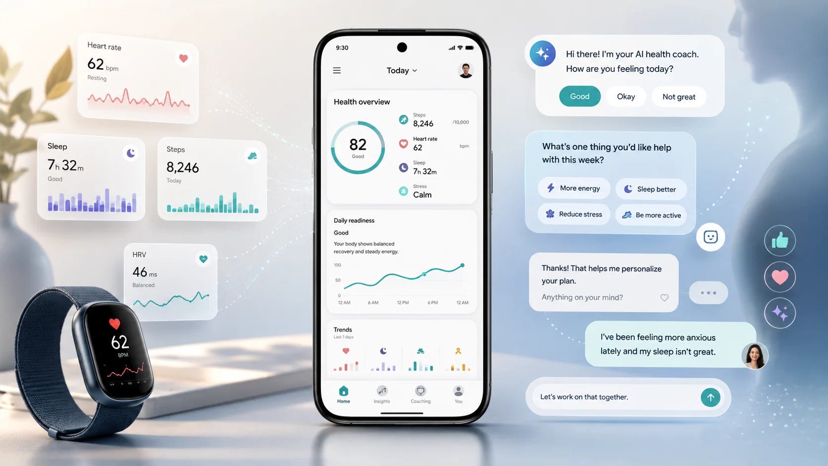
I talk to AI every day now. Sometimes it is a terminal, sometimes the ChatGPT window, sometimes my phone, sometimes an app on the desktop. Sometimes I type it. Sometimes I just say it out loud. The whole thing has become completely ordinary.
Then I worked out how recent all of it is. ChatGPT arrived a few years ago, and that is the entire history of the habit. The part that interests me is not how fast we learned to use it. It is how fast we stopped finding it remarkable.
Almost every AI feature I am asked to look at has the same shape: a competent chat box with very little on either side of it. That gap is what this issue is about.
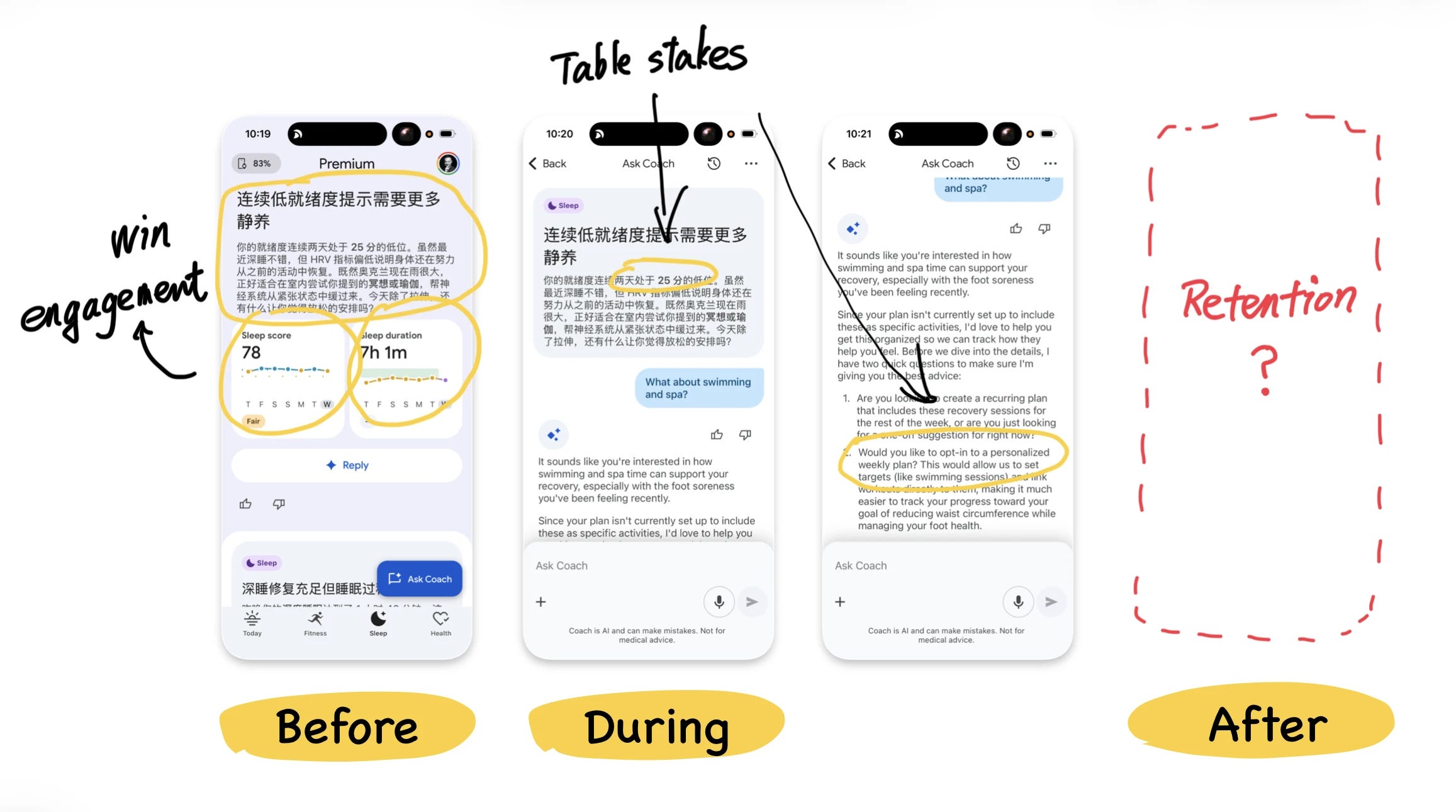
The chat box is becoming table stakes
The chat interface in Google Health is not new. You ask, it answers, the conversation continues. That pattern now shows up in almost every category of software.
The more interesting parts sit on either side of it. How does the conversation start, and what happens after one ends? I find it useful to split an AI conversation into three stages.
Before: someone has to speak first
Before you type anything, the system has to find something worth discussing and turn it into a question that is easy to answer.
Google Health is good at this. It reads your sleep and activity and produces something like: “Going to bed around midnight seems to be working well for you. Does keeping that schedule feel manageable as you head into the weekend?” Underneath sit a few answers you can tap.
You never face an empty input field. That matters more than it sounds. A blank box holds unlimited possibility and still leaves most people with no idea where to begin, which is one of the quietest ways a capable AI feature dies.
Google speaks first and you only have to tap. From your side the coach feels attentive. From Google’s side, the cost of getting one more signal out of you has dropped to a single interaction.
During: the part that will commoditise
Google Health reads personal data, draws charts, cites external sources, and keeps things moving with follow-up questions. It does all of that competently.
It will also stop being a differentiator. Any company with enough model access, data and engineering will eventually ship a reasonable chat experience. The chat box is on its way to becoming infrastructure.
After: where retention actually lives
Will it summarise what changed a week later? Will it notice your sleep drifting and raise it before you ask? Will it remember the goal from last time and check on it in a few days?
Across three weeks, almost none of that happened. No automatic weekly report, and the coach rarely picked up an earlier thread. Nearly every interaction still started with me opening the app.
Some of that is fair. The product is new, and unsolicited health advice carries real risk. One wrong or unnecessarily alarming notification could do lasting damage to trust.
The pattern still holds well beyond Google. Before decides whether people start. During is table stakes. After is what turns a feature into a relationship.
Two notes that sharpened this
Month one is not the signal. Most teams hit peak AI productivity in the first month and then quietly plateau. The early weeks feel like finding a new gear, because the obvious inefficiencies go first. What is left after that are capability gaps and knowledge gaps, and those are not prompting problems. AI stops multiplying and starts maintaining.
Bolting on is not the same as redesigning. Most teams still use humans as glue, copying out of one tab and into another so the next system can catch up. It looks like coordination, and it is friction wearing a lanyard. The steam engine did not transform manufacturing when it was invented. It transformed manufacturing when factory owners stopped bolting it onto the existing floor plan and redesigned the floor.
Try this on your own product
Take your AI feature and split it in three.
Before: what makes someone start? If the answer is an empty box and a hopeful tooltip, that is your weakest layer. During: is there anything here a competitor could not ship in two quarters? After: what happens between sessions, without the user doing anything at all?
Most products I look at have a strong middle and almost nothing on either side.
Also from me
A few other things I have written, outside the teardown.
Thinking is not a step you can hand off
I switched to a new research workflow a few months ago. Perplexity for discovery, Obsidian for notes, Claude for synthesis. It works. The output is faster and usually pretty good.
But somewhere in that chain I noticed something: I felt oddly distant from the work. Like I had supervised it rather than done it.
So I pulled out a notepad for the next project. Slower, messier, nothing shareable at the end of it. But when I sat down to actually write, the thinking was already there. I had not just gathered it, I had done it.
I do not think that part has an equivalent in any tool I have found. Not because the tools are bad. Because the thinking is not a step you can hand off without handing off the thing itself.
Now the default is sameness
There is a quiet irony happening in product design right now.
For years, the smart move was to borrow from the big players. Apple’s visual language lowered the trust barrier. Familiar felt safe. So everyone pulled from the same shelf.
AI has made that instinct dangerous.
Build something with Claude or any of the popular tools, and you will get a pale, clean, slightly washed-out interface almost by default. Not because you chose it. Because the tool steered you there before you even noticed. A lot of products launching right now look like cousins.
This is where a designer earns their fee. Not by making things look good, but by making deliberate choices that put distance between your product and the AI house style, while still making sense to your specific audience.
Differentiation used to be hard. Now the default is sameness. The gap is the opportunity.
MVP vs MLP: why most products stay minimum and never lovable
Most products get to “it works” and stop there. Eric Ries never said an MVP should be low quality, but that is what it became in practice: ship the function, promise the rest later, never come back.
I spent a second pass on CUBE, a small isometric type tool I built. The interesting part is what I did first. I did not add features. I cut them. Then I spent the time on the typing feel, the cursor, the transitions between views, and the sound.
The feature list did not change at all. The feeling did.
Brian de Haaff has a good line for this: you could eat a can of cat food if you had to, but you would not ask for a second serving. Jussi Pasanen puts it better as a model, build a slice across functional, reliable, usable and delightful, instead of one layer at a time.
What is new is that designers can now do this without waiting for an engineer. I did the motion in this thing with prompts.
Honest limit: CUBE does not solve a real problem. If yours does, you still need an MVP, and it still has to be good.
Where to next
The full Google Health teardown is on the site, including how many collection points fit on a single card and what its citation habits give away: bearliu.com/blog/google-health-extraction-by-design
Which of the three layers is thinnest in what you are building? Hit reply and tell me. I read everything that comes back.

Hello, I’m Bear.
I’m a product designer in Auckland, New Zealand. Most of my work is as a Fractional Design Partner, which usually means being the design lead a small team cannot yet hire full time.
Design Decisions is where I take one product apart each week and write up the decisions behind it. I make videos and record a bilingual podcast for much the same reason. I like working things out in the open.
bearliu.com · the full teardown library, and what I do for teams
hi@bearliu.com · the old fashioned way, and I read every reply
youtube.com/@Bearliu · a video is worth a thousand words
x.com/bearliu · shorter thoughts, as they happen