

Hello my friend!
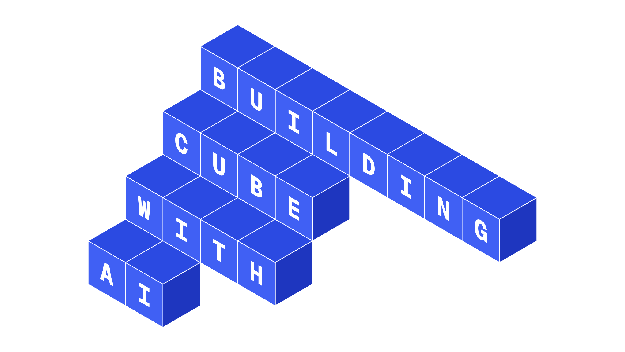
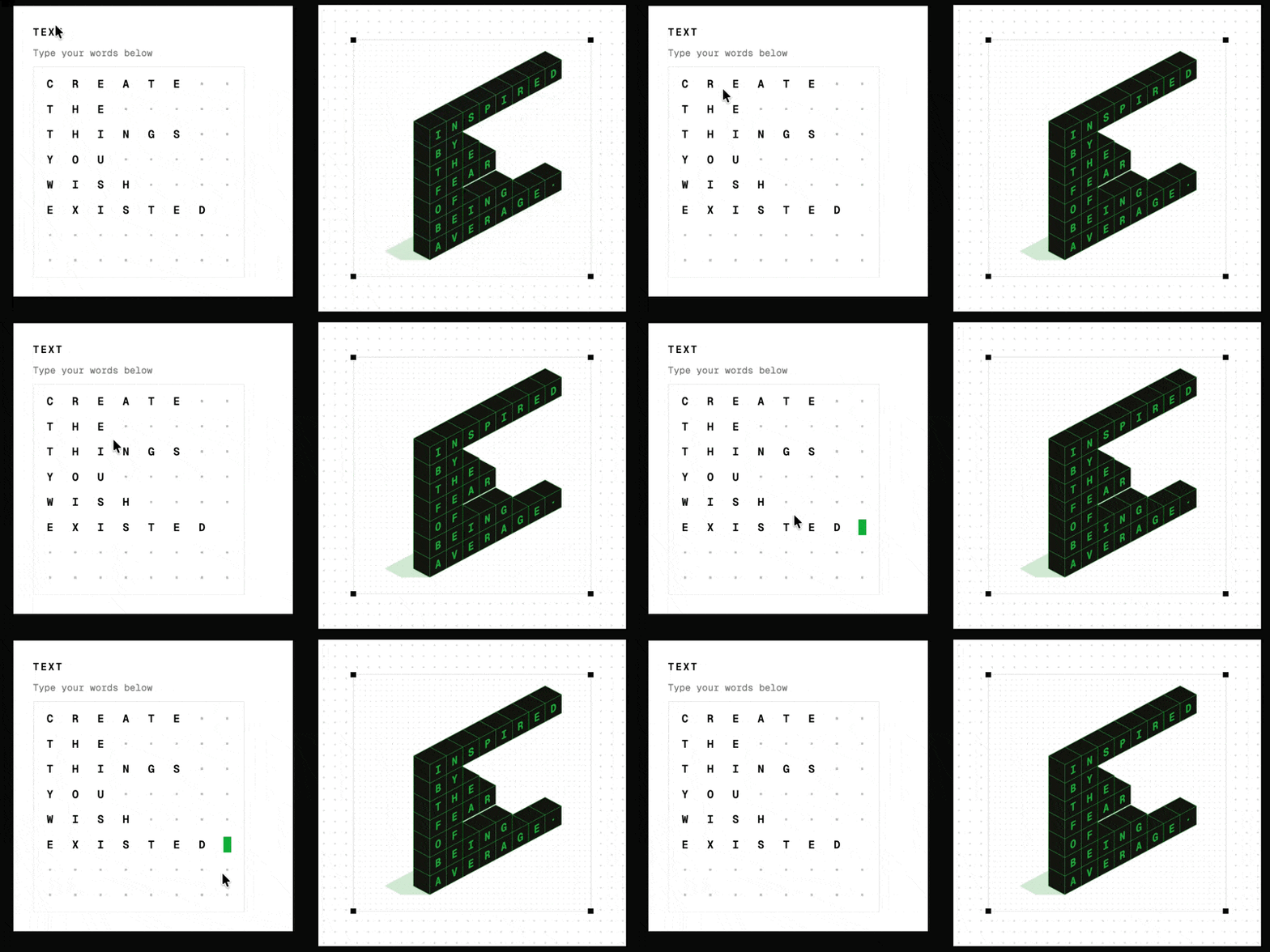
Recently I’ve been working on CUBE, a small web app that turns text into 3D isometric typography. You type something, choose a style and colour, and export an image or animation.
I started it as a side project, partly to explore an idea I’d had for a while, and partly to see what it feels like to design and build alongside AI.
As a product designer, I’ve spent years working with developers to bring ideas to life. With Claude Code, I can now do much of that work myself.
It’s exciting. But it also raises a question: when AI can handle much of the implementation, where should I spend my time as a designer?
Looking through my CUBE notebook, I found a few decisions that mattered much more than the code.
It started with a Pinterest board
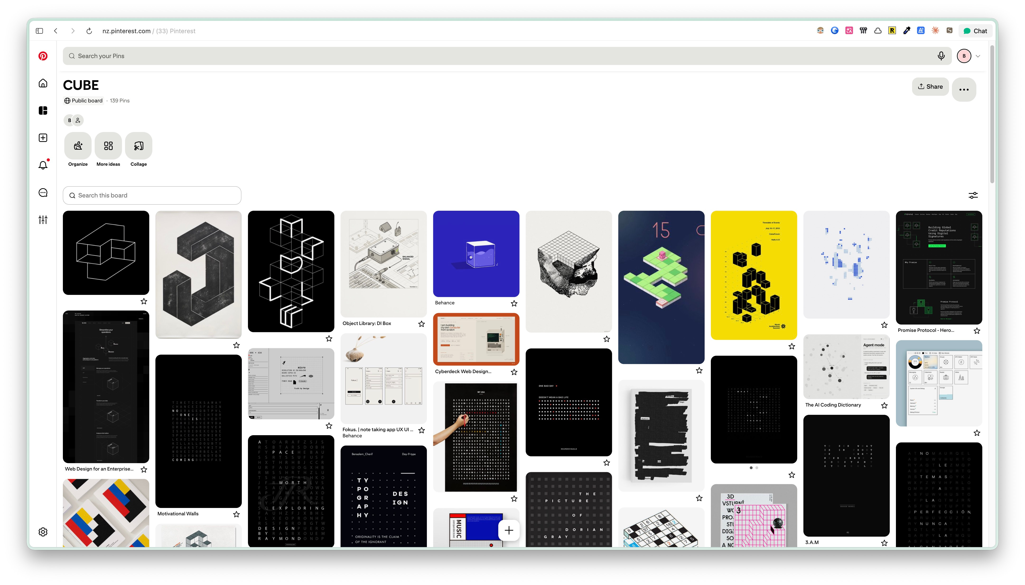
Like many of my projects, CUBE started with collecting references. I made a Pinterest board of isometric typography, geometric shapes, and interfaces I liked.
For the interface, I kept coming back to Braun’s industrial design: simple controls, clean typography, and Dieter Rams’ principle, less but better.
I also loved some vintage styles. But when I put them next to CUBE’s modern, geometric output, something didn’t feel right. It was like mixing two different products.
So I dropped that direction.
That’s one thing I’ve always enjoyed about design. You can explore dozens of directions, but eventually you have to decide what belongs together.
AI makes it easy to generate five variations of an interface in almost no time. That’s wonderful for exploring ideas. It’s also tempting to keep adding things simply because you can.
I found myself needing to be more deliberate about what to leave out.
Four ideas on one page
One notebook page had four different product ideas: CUBE, Big Type for displaying very large text, Quote Type for making quote images, and Bubble Type.
I briefly considered putting them all into one typography tool. More features, more possibilities. It sounded appealing.
But I wanted something simpler: type a few characters and immediately see something interesting.
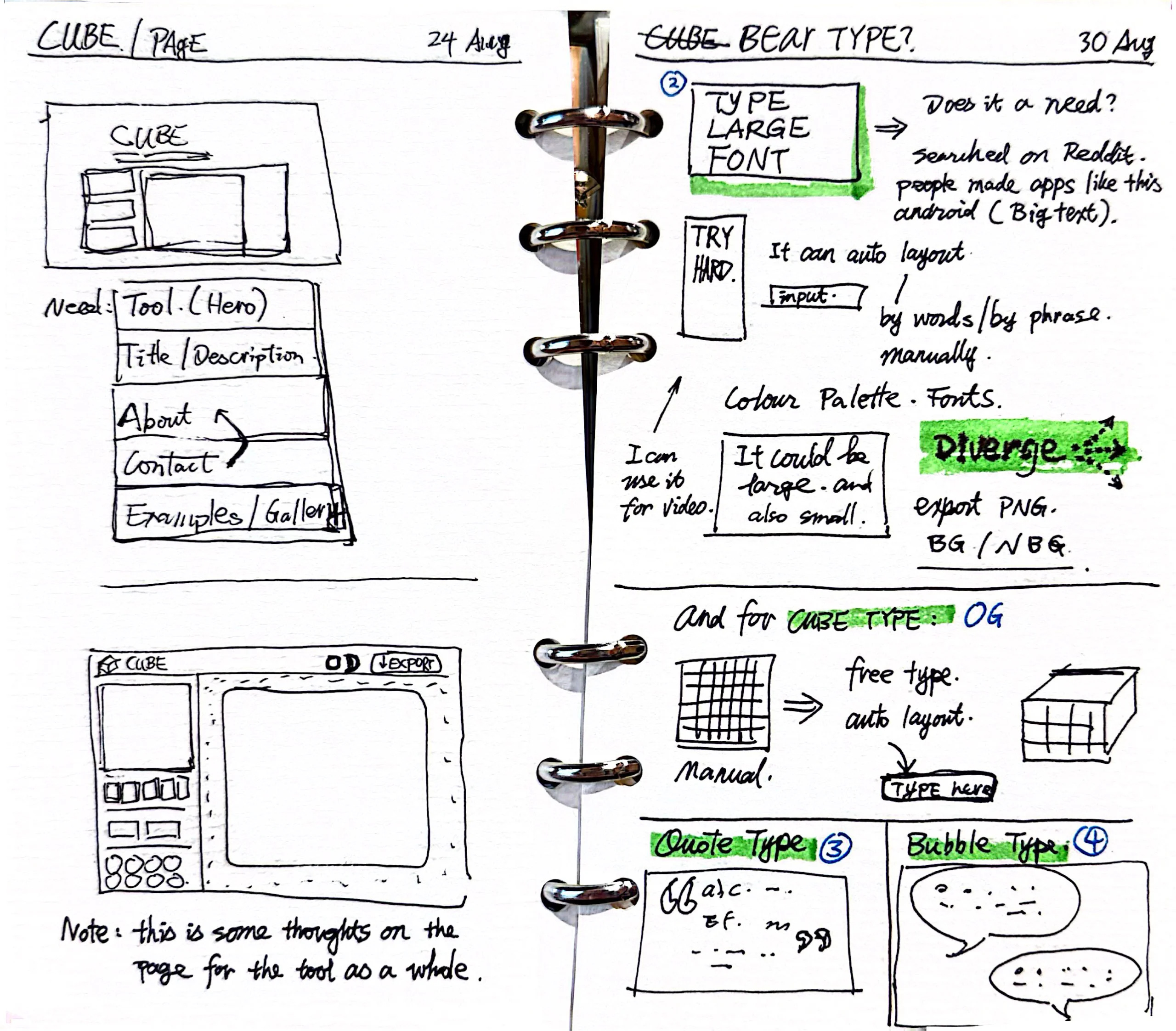
Even that interaction involved a decision. My first sketches used a grid-based text input. It looked distinctive, but would people understand it?
Everyone knows how to type into a text field. Why make that part complicated?
I switched back to a regular input with a character limit. The interesting experience should come from what happens to the text, rather than how you enter it.
I wrote down the core workflow:
Type something. Change the style. Export the result.
That became my reference whenever I wanted to add another feature. The other ideas are still in my notebook. I may explore them again someday.
The details I cared about
Once the basic functionality worked, I explored the smaller interactions: transitions between views, hover states, and the animation when switching between light and dark mode.
Some started as rough drawings. I’d photograph a notebook page, share it with Claude Code, explain what I wanted, and test the result.
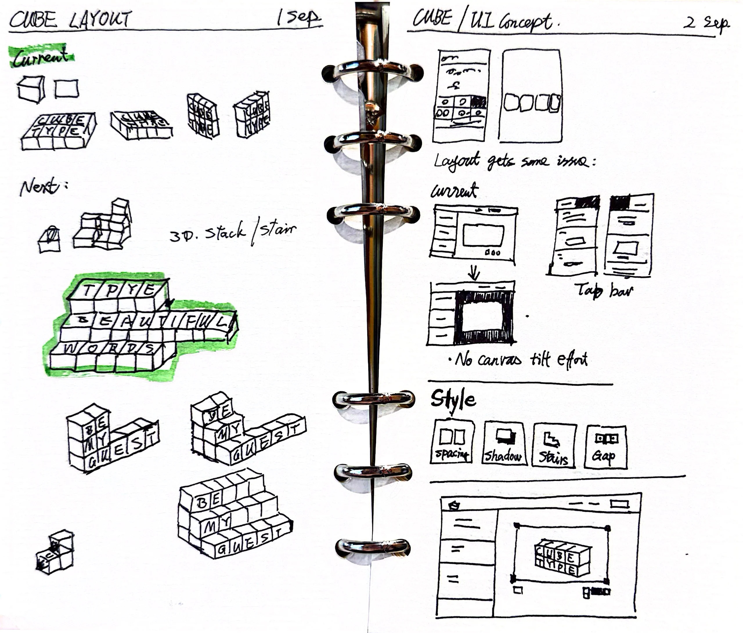
The first version was rarely perfect. Sometimes an animation felt too fast or the movement was awkward. I’d adjust it, try again, and occasionally go back to the drawing board.
I really enjoyed this process.
In previous design jobs, I’d build prototypes in Figma, explain interactions to developers, and discuss what was worth implementing. Some details wouldn’t survive that process. Now I can experiment with them directly.
It reminded me of Jussi Pasanen’s illustration of a Minimum Viable Product: build a small slice that considers functionality, usability and emotional design together.
Brian de Haaff also made a memorable case for the Minimum Lovable Product. His analogy: you can survive on cat food, but you probably won’t love eating it.
I made a video about MVP and MLP, using CUBE as the example:
I think AI makes this approach more practical. CUBE doesn’t solve an urgent problem. People can live perfectly happy lives without a 3D typography generator. So the experience itself matters.
That doesn’t mean every product needs fancy animations. Sometimes removing an unnecessary interaction is just as useful as adding a nice one.
Three words, but do they mean anything?
Early on, I wrote down three things I wanted CUBE to be:
Effortless. Shareable. Playful.
I know. These sound like words you’d see in hundreds of design presentations.
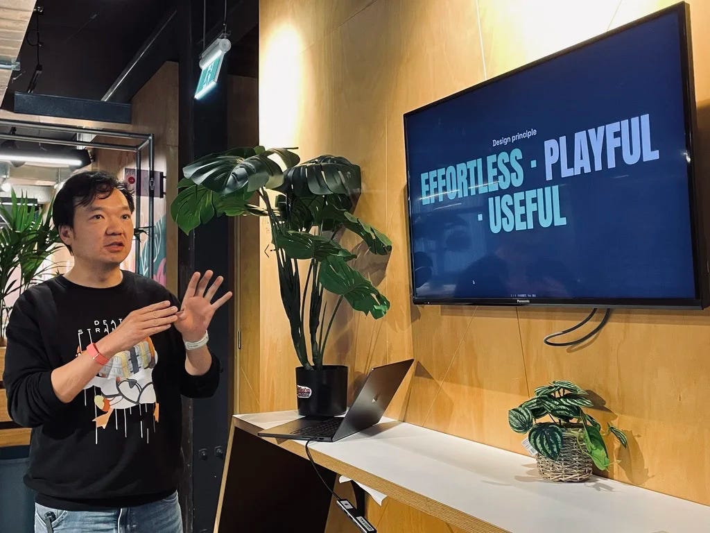
So I tried to make them useful.
For effortless, I could look at whether visitors started typing. For shareable, I could check whether they exported something and whether their sharing links brought anyone back.
Playful was harder. I could measure how many styles someone tried, but that wouldn’t explain why. Maybe they were having fun. Maybe they couldn’t find anything they liked.
That’s where watching someone use the product, listening to feedback, and making design judgments still matter.
Data can tell me how many people exported a file. It can’t tell me whether they loved the result or were disappointed after downloading it.
What changes for designers?
Working on CUBE has made me optimistic about designing with AI. I can go from sketches to a working product, test details directly, and change things without a long handover.
But AI is also very willing to build whatever I ask. If I request another feature or a more elaborate interface, it will happily make one.
I still have to decide whether it belongs in the product.
And after launch, I discovered another set of questions: who actually uses it, what they make, and how they find it. That’s been a different experiment, which I’ll share in the next issue.
I also recorded a video walkthrough of my CUBE notebook, including the sketches and the development process:
Try this on your own product
Write down the three words you want your product to be. Next to each one, note what you could actually measure, and what you would only learn by watching someone use it.
Then look at the last feature you added. Did it make the core workflow better, or did you add it because it was easy to build?
Also from me
A few other things I have written, outside the main story.
English is how I work. Chinese is how I think fastest.
For a few years, I had a strict rule for myself: read everything in English.
I live and work in New Zealand, so it felt sensible. It also felt disciplined. If a Chinese translation was available, I would still choose the English version.
Recently I have started using translation tools more often, especially when I am trying to understand a difficult subject quickly. My first reaction was embarrassment. I wondered if my English was going backwards.
Then I looked at how I actually spend my days. I speak English with clients. I write in English. I read it constantly. I am not short of English practice.
The point of reading was never to prove that I could read English. It was to understand something.
English is the language I work in. Chinese is still the language I think fastest in. I need both, and I am finally comfortable using both.
A book I read fifteen years late
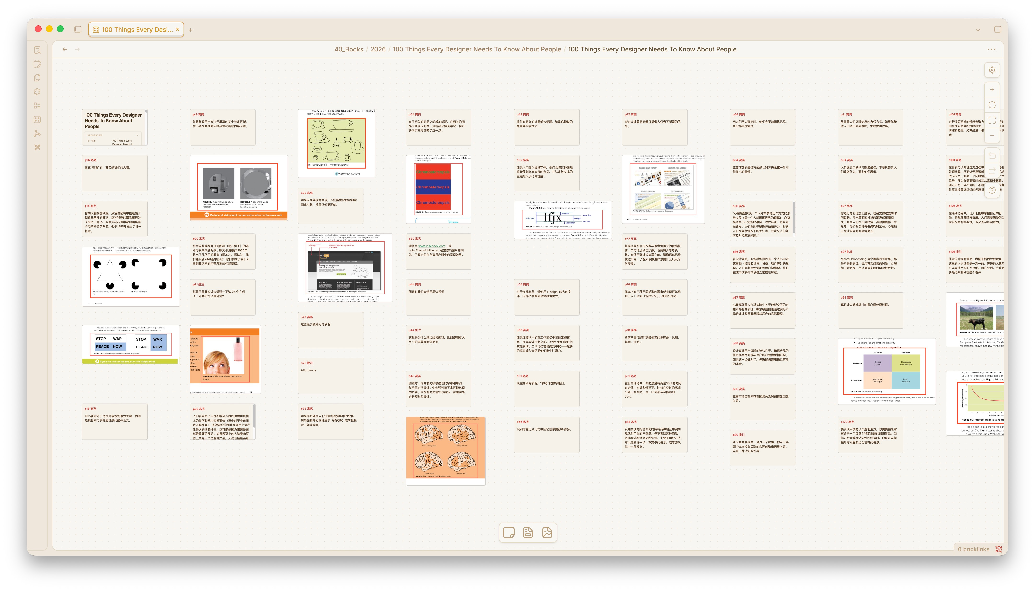
I finished this book fifteen years after it came out. Which, given that I’ve been doing design work for most of those fifteen years, is a slightly embarrassing thing to admit.
“100 Things Every Designer Should Know About People” is not a hard read. It’s just 100 psychology principles, explained plainly. No theory rabbit holes, no academic posturing.
But here’s what surprised me: reading it now, after years of shipping real products, landed completely differently than I think it would have earlier. Every principle clicked against something I’d actually built, or misjudged, or fixed by accident.
The framework was always there. I just didn’t have it.
If you work in product and haven’t read it, it’s worth a weekend. Especially if you think you already know most of it.
My daughter’s risk assessment
My daughter told me not to go for a walk last night.
“It’s too dark. It’s dangerous. You’re important to us, Dad.”
I was touched for about two seconds.
Then she added: “We still have a lot of mortgage left.”
Well...
Love, apparently, comes with a repayment plan.
Where to next
The full CUBE story is on my site, including what happened after launch: bearliu.com/blog/building-cube-with-ai
If you’re also designing with AI, I’m curious: are you spending more time on design decisions, or simply building more things?
Hit reply and let me know.
Thanks for reading!
Bear

Hello, I’m Bear.
I’m a product designer in Auckland, New Zealand. Most of my work is as a Fractional Design Partner, which usually means being the design lead a small team cannot yet hire full time.
Design Decisions is where I take one product apart each week and write up the decisions behind it. I make videos and record a bilingual podcast for much the same reason. I like working things out in the open.
bearliu.com · the full teardown library, and what I do for teams
hi@bearliu.com · the old fashioned way, and I read every reply
linkedin.com/in/bearliu · where most of my English writing goes first
youtube.com/@Bearliu · a video is worth a thousand words
x.com/bearliu · shorter thoughts, as they happen