


My legs and knees are not what they used to be. Mostly that is age. Leg days at the gym help, but I wanted something that took less effort.
So now I do a minute of squats while I brush my teeth, morning and evening. Easy as. Brushing my teeth is already a habit, and adding a step to an existing habit is far easier than building a new one. The point is to wire the two together until they feel like one thing.
Linear teaches its keyboard shortcuts in much the same way: inside work you were already doing, never in a tutorial.
The cheapest training system in software
Almost every common action in Linear has a keyboard shortcut. Change an issue’s status, adjust priority, expand a list, create a task, switch workspace, all without reaching for the mouse.
The decision worth noticing is where those shortcuts live. Hover over an action and the shortcut appears inside the tooltip you were already reading.
No onboarding tour. No ten-minute video. A few characters added to something that was going to be on your screen anyway.
Plenty of products have the same shortcuts. Most of them keep the list in a help page, or behind a question mark, or in a modal you can summon once you already know it exists. That version only ever reaches people who go looking for it. Linear’s version reaches everyone, because it arrives attached to work they were already doing.
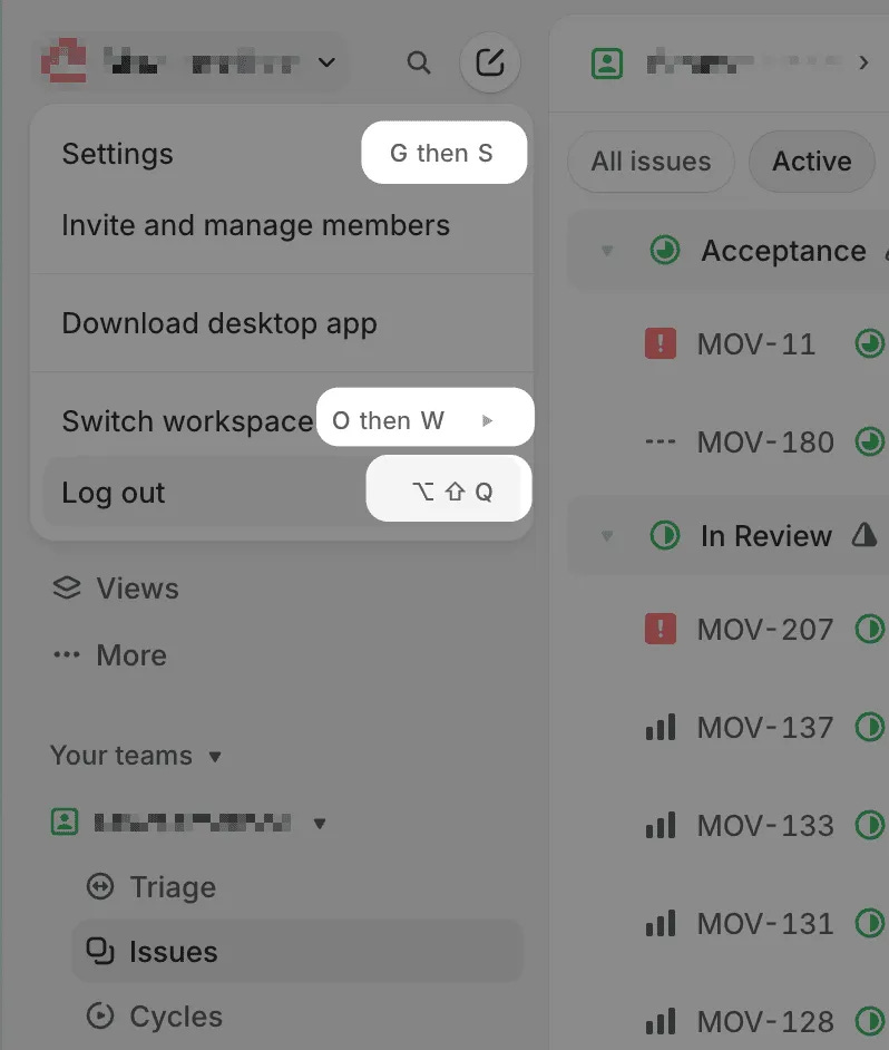
The first time, you click the button. The second time, you notice the shortcut and try it. A few weeks in, a good number of repeated actions have stopped requiring any thought at all. Your fingers go without asking.
Cognitive cost can be relearned. Physical cost is slower.
In most software the learning cost stays in your head. You remember where a feature lives, which page holds a setting, which menu creates a project. Switch to a competitor and you spend a few uncomfortable days learning a new layout, then you are fine.
Linear moves part of that cost somewhere else.
It is closer to driving. You do not work out how far to turn the wheel on the way into a corner, or decide where your foot goes before you brake. Those are physical habits now, which is exactly why a car with a different control layout feels wrong even when it is technically simple to operate.
After a few months in Linear, leaving means giving up a whole set of hand movements. The switching cost is no longer just migrating data and comparing feature lists. Part of it is retraining your body.
The same feature would do much less somewhere else
None of this works in isolation. It works because of who Linear had already chosen.
Engineers spend their days inside terminals, code editors and keyboard-first tools. Linear is not teaching them a new way of working. It is extending one they already have.
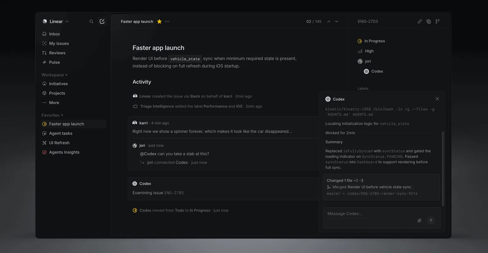
Asana or Notion could ship the same number of shortcuts tomorrow. Their audiences are broader and plenty of those people still prefer to click or tap. Same feature, far less value.
So the trade-off is not really about shortcuts. A feature rarely becomes an advantage on its own. It becomes one when it connects to a habit a specific group of people already has, which means the audience decision has to come first and the feature second.
A moat holds you in place too
There is a bill attached to this, and it arrives later.
Once a shortcut is in somebody’s fingers, you cannot move it. A menu can be reorganised between releases and most people adapt inside a day, grumbling a little. Change what a key does after two years and you have broken something people were not consciously using, which makes it the hardest kind of complaint to answer. They cannot tell you what is wrong. They can only tell you it feels wrong.
The same mechanism that raises the cost of leaving raises the cost of changing your mind. Every action you train into somebody’s hands is one you have quietly promised to keep. That is a fine promise to make, as long as you know you are making it.
Two notes that sharpened this
Users do not hate learning. They hate learning things that have nothing to do with their work. Bonnie Nardi studied why spreadsheets succeeded where programming languages did not. Her answer was that spreadsheets mapped onto concepts people already held. A baseball fan does not struggle to calculate a batting average. It is his world, and the formula only makes it faster.
So the question to ask early is whether you are building something new, or asking somebody to learn a new vocabulary before they can do the thing they came here to do. One of those is a product. The other is homework.
A tool sticks when you need it for something real. I had skimmed past Claude’s Skills feature in some article and none of it landed, because I had no reason to care yet. Then I wanted to automate a set of repeated prompts on a client project, and it went from background noise to something I actively wanted to understand.
Structured learning has its place. The messy version, where you hit a wall and work it out mid-flight, is the one that tends to stay. Linear’s tooltips are that second kind, handed to you during the work rather than before it.
Try this on your own product
Take the five actions your customers perform most often and watch somebody fluent do them. Not a new user. Someone six months in.
Then ask the question that actually decides retention: could that fluency be carried into a competitor’s product, or does it only make sense inside yours?
Speed that transfers is a feature, and a good one. Speed that does not transfer is a moat. Most teams build the first and describe it as the second.
Also from me
A few other things I have written, outside the teardown.
Save the Cat is a user research method
A screenwriting book taught me more about user testing than most UX frameworks I’ve read.
I picked up “Save the Cat” this week, a classic screenwriting guide. The title refers to a simple technique: if your protagonist is morally grey, give them one small moment of kindness early on. The audience forgives a lot after that. One gesture does the work of pages of backstory.
The author also suggests a brutally honest feedback method. Take your story pitch to a café, find a stranger, and ask if they’d mind hearing a plot summary. If their eyes glaze over mid-sentence, the story isn’t working. No survey. No structured debrief. Just a real human in real time.
That’s a product research method, not just a screenwriting trick. How often do we sit in a room with a stakeholder deck instead of describing our product to someone who has never heard of it? If you can’t hold their attention in 60 seconds, no amount of polish fixes the underlying problem.
The book also maps out ten core story archetypes. The Hero’s Journey is just one of them, what the author calls the Golden Fleece. The others include Buddy Love, Institutionalised, and Monster in the House. His point is striking: every archetype works because a Stone Age human would understand it. The emotional logic is that old.
For product design, this translates directly. If your value proposition requires cultural context, industry jargon, or three onboarding screens to land, you’ve probably drifted from something instinctively felt to something that has to be explained. The best products, like the best films, set up an expectation and then deliver on it. The user already knows what they signed up for.

Rest that matches the work
I used to think rest meant switching tasks.
Deep in a design problem, I’d hit a wall and reach for Twitter. Five minutes, I’d tell myself. Just a reset. Then I’d come back and wonder why the thinking felt scrambled, why I had to rebuild the thread of what I was doing before I could move forward at all.
The break wasn’t the problem. The content of the break was.
Your brain doesn’t clear its working memory the way a computer flushes a process. When you swap deep thinking for a feed of unrelated, low-quality information, you’re not resting the system. You’re loading something else into it.
Rest that matches the intensity of the work: a walk, silence, staring out a window. Not another stream of content competing for the same channel.

Design is space and time
Had coffee with a friend who studied industrial design at one of China’s top art schools.
He told me something his professor said on the first day: design is about space and time. Not aesthetics, not problem-solving in the abstract. A specific problem, in a specific place, at a specific moment.
The example stuck with me: the lecture hall chairs were angled slightly forward. Uncomfortable enough that you had to engage your core to sit upright. Students stayed alert. They paid attention. Put those same chairs in a living room and they’d be awful. Same object, wrong context, completely broken.
We do this in product all the time. We chase solutions before we’ve fixed the coordinates. What kind of user? What moment in their day? What are they actually trying to do right now?
The constraints are not the obstacle. They are the brief.
Where to next
The full Linear teardown is on the site, including the $35,000 of marketing that sat underneath $100M of ARR: bearliu.com/blog/linear-the-restraint-tax
Which habit would a customer have to unlearn in order to leave you? Hit reply and tell me. I read everything that comes back.

Hello, I’m Bear.
I’m a product designer in Auckland, New Zealand. Most of my work is as a Fractional Design Partner, which usually means being the design lead a small team cannot yet hire full time.
Design Decisions is where I take one product apart each week and write up the decisions behind it. I make videos and record a bilingual podcast for much the same reason. I like working things out in the open.
bearliu.com · the full teardown library, and what I do for teams
hi@bearliu.com · the old fashioned way, and I read every reply
linkedin.com/in/bearliu · where most of my English writing goes first
youtube.com/@Bearliu · a video is worth a thousand words
x.com/bearliu · shorter thoughts, as they happen