

Hello my friend!
A potential client asked me a question I should have been able to answer.
“Is this your best design?”
He had asked to see some work, and I’d shared a project in progress. My latest portfolio was about two years old, from when I was still at Xero. I didn’t have a good way to show what I was doing now.
The embarrassing part was that I’d recently told another designer their portfolio was a marketing asset. It didn’t have to be perfect. It just needed to help start a conversation.
Good advice. I hadn’t followed it myself.
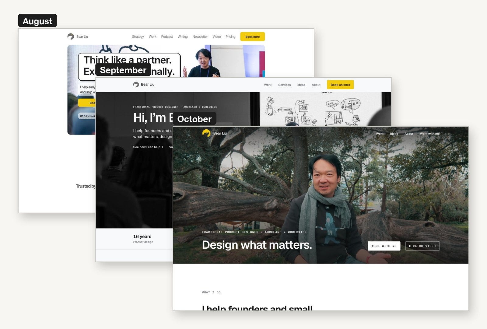
Over the next few months, I went through three versions of my website. I updated the projects, rewrote the offer, asked for feedback, and changed the design again.
Looking back through my notebook and the changes I made, I can see that I was gradually working out a more useful question: what did someone need to understand before they would want to work with me?
First, I needed something to show
The first rebuild took around four days.
By then, my work had changed. I was working independently as a fractional design partner, helping teams that needed design experience but weren’t ready to hire a full-time design lead. My old portfolio had been put together for a different situation.
The difficult part was deciding what to keep.
At Xero, I’d worked on around 20 projects, from small features to larger pieces of work. I chose two. From my other client and earlier app work, I chose four more.
There was plenty I could have included. But someone browsing on their phone before a call probably wasn’t going to read the history of my career.
Once I’d made those choices, building became much easier. I used Claude to help put the pages together, and published something I could actually send to people.
Then I recorded a one-minute walkthrough and shared it for feedback.
A designer friend, Geoff, pointed out something I’d missed: he didn’t know the first product I was showing. Without that context, he lost the thread.
I knew the project so well that I’d forgotten to introduce it.
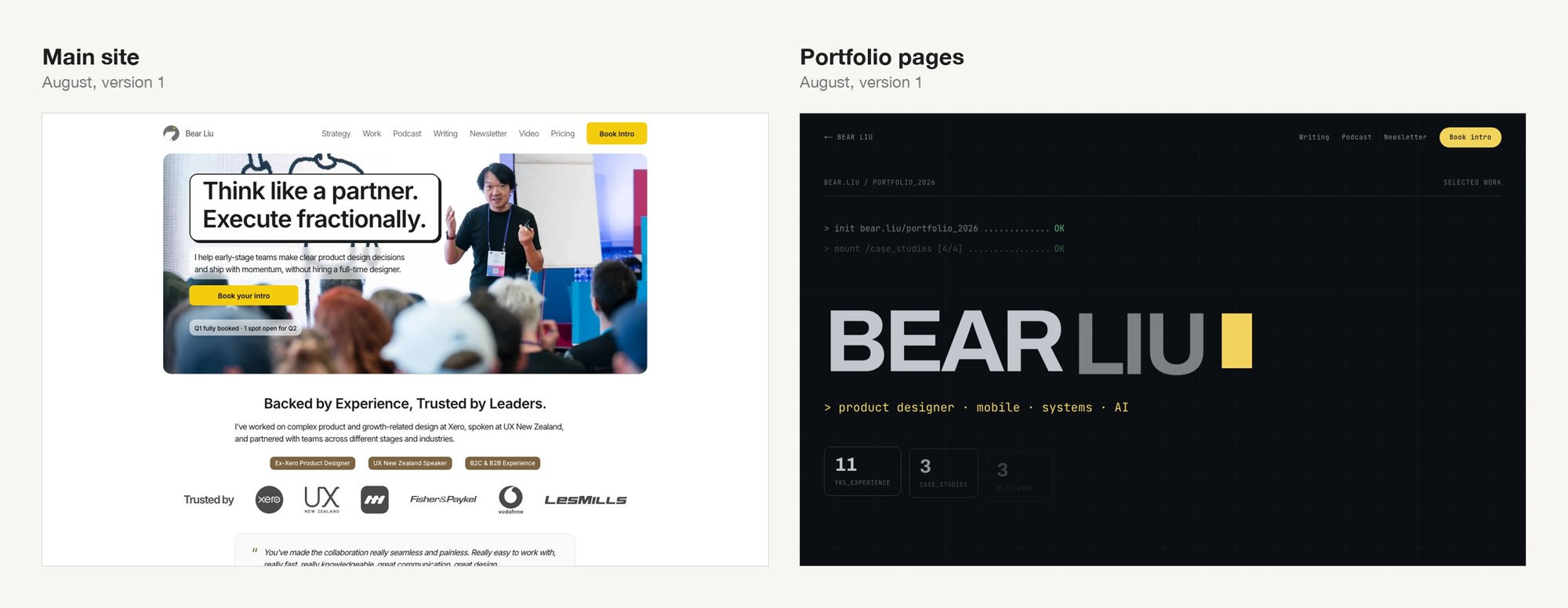
The message was clearer. The website still felt wrong.
The first version still felt like pieces assembled at different times. The main website was light. The portfolio pages were dark, with a different visual style and animations. I’d made them through different workflows, and it showed.
I liked parts of each. Together, they didn’t quite feel like the same person.
So during September, I redesigned the whole site. I brought the pages into one visual style and worked more on explaining the service: what I could help with, how I worked with teams, and where someone could begin. I added an introduction video, client testimonials and a way to book a call.
This second version was much more consistent. The message was clearer, and I’d put more thought into how everything fitted together. I felt it was doing a better job than the first.
But somewhere in the back of my mind, I knew the visual design still wasn’t quite there. I was talking about business outcomes and design judgement. Would someone looking at the site feel confident about the quality of the work?
I’d been staring at it for too long. I needed a fresh pair of eyes.
Getting someone else to look
In late September, I had a 45-minute portfolio review with Eric Sin, who had just landed a Staff Product Designer role at Netflix.
I brought two questions: was the site communicating the value of working with me, and how should I balance that message with showing the craft?
Eric had read it carefully. He understood my experience and what I was offering. His feedback was that the content was largely there, but its placement and presentation were getting in the way.
My name was doing a lot of work in the hero section.
“I already know your name, I went to bearliu.com,” he said.
Fair point.
He also picked up on my claim about working with startup and enterprise products at every stage. That covered pretty much every company. It didn’t give someone much to remember.
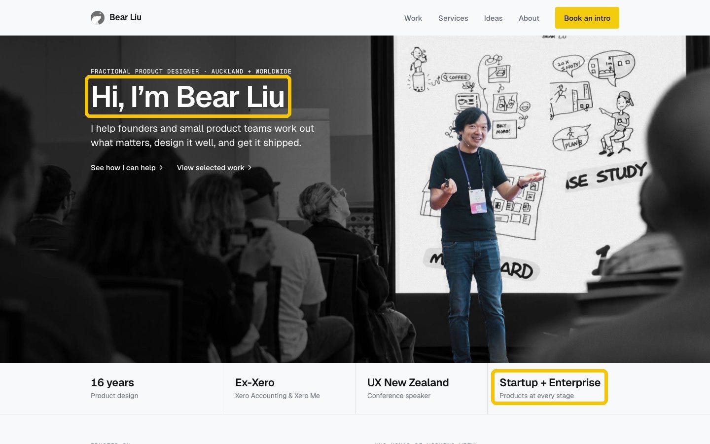
He suggested a narrower focus on zero-to-one work. And he showed me a quick redesign he’d put together in about 20 minutes: clearer type, readable logos, work appearing earlier, and a more direct path towards working together.
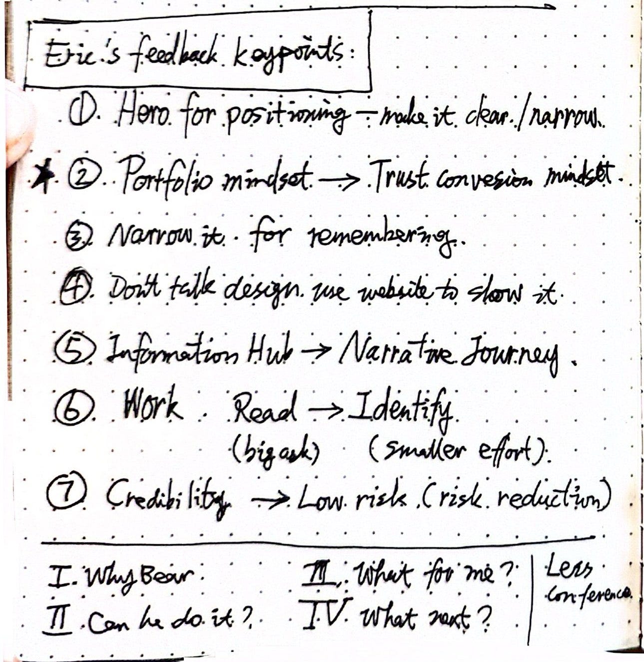
In my notebook, I wrote down seven points from the conversation. I put a star beside this one:
Portfolio mindset → trust conversion mindset.
That sounds a little abstract. Underneath it, I wrote four questions that made it more practical:
Why Bear? Can he do it? What’s in it for me? What next?
I could explain my experience at length. A founder arriving with a product problem still needed help answering those questions.
What I changed
The third version went live in early October.
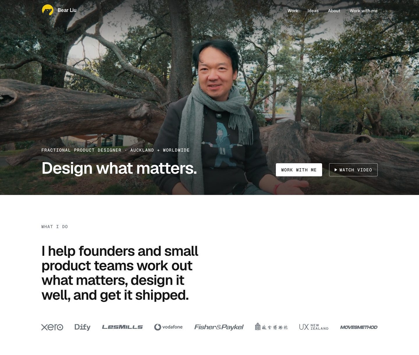
I changed the main headline to “Design what matters.” Under “What I do”, I explained the offer in a sentence:
“I help founders and small product teams work out what matters, design it well, and get it shipped.”
That gave the introduction a different emphasis. I still appeared in a short, casual video, but there was a clearer explanation of why someone might be there.
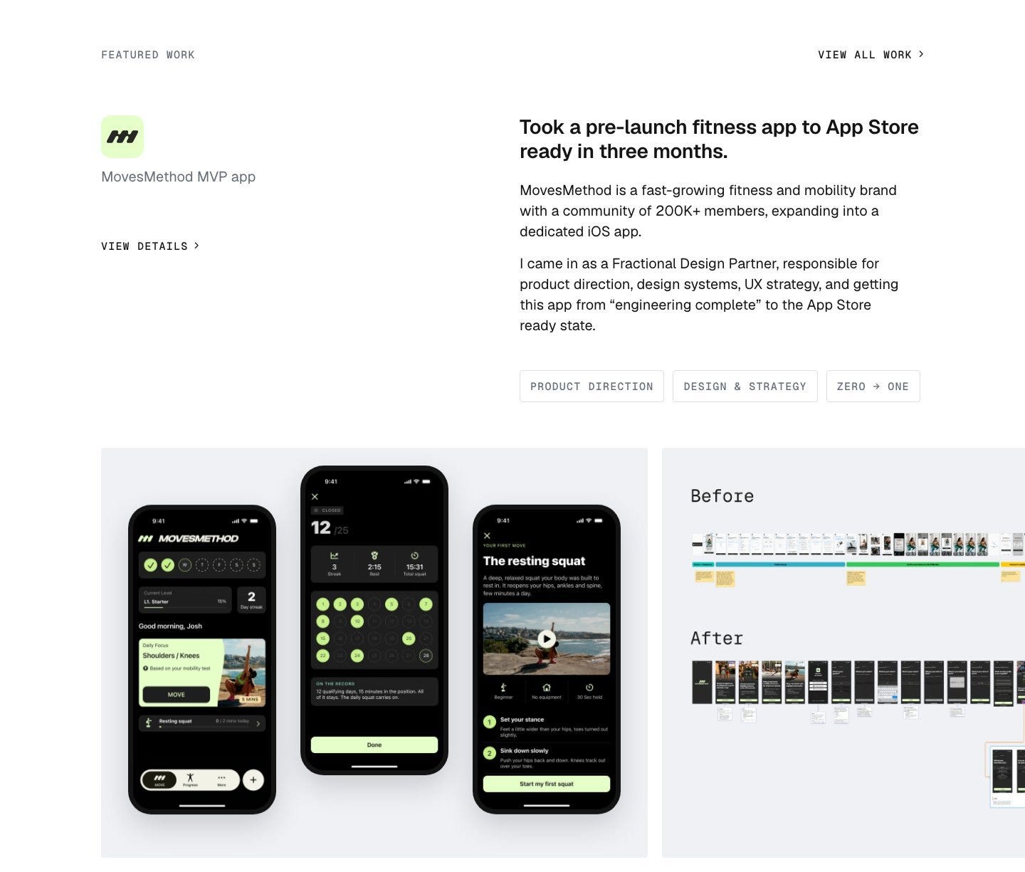
I also rebuilt the featured work around four projects: MovesMethod, Xero Guided Setup, JAM and Xero Me.
Each began with a short statement about the work and a little context about my role and the result. Then came the screens. Someone could get an initial sense of the project without opening a long case study.
For JAM, that meant explaining that I’d built a one-minute AI speaking coach from zero to one. For Guided Setup, it meant showing the path from a new user’s first run to getting value from Xero.
I also spent time exploring how much I could show within each frame. One could scroll through a long page, another could cycle through screens, and another could travel across a larger canvas of work.
Working directly with code and motion made this much more interesting. I could use time as another dimension: the frame stayed the same size, but it could reveal different parts of the product. I didn’t have to squeeze everything into one static image.
The best part was getting it to work on both desktop and mobile. A small screen didn’t have to mean leaving most of the work out.
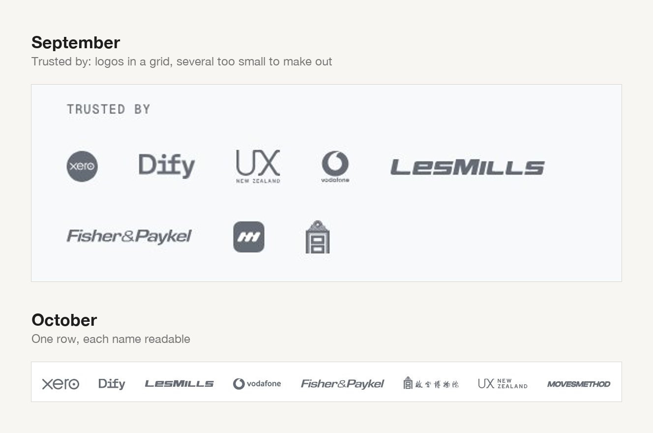
Eric had also noticed that some client logos were too small to read. I reworked those. A familiar name isn’t much of a reassurance if you can’t make it out.
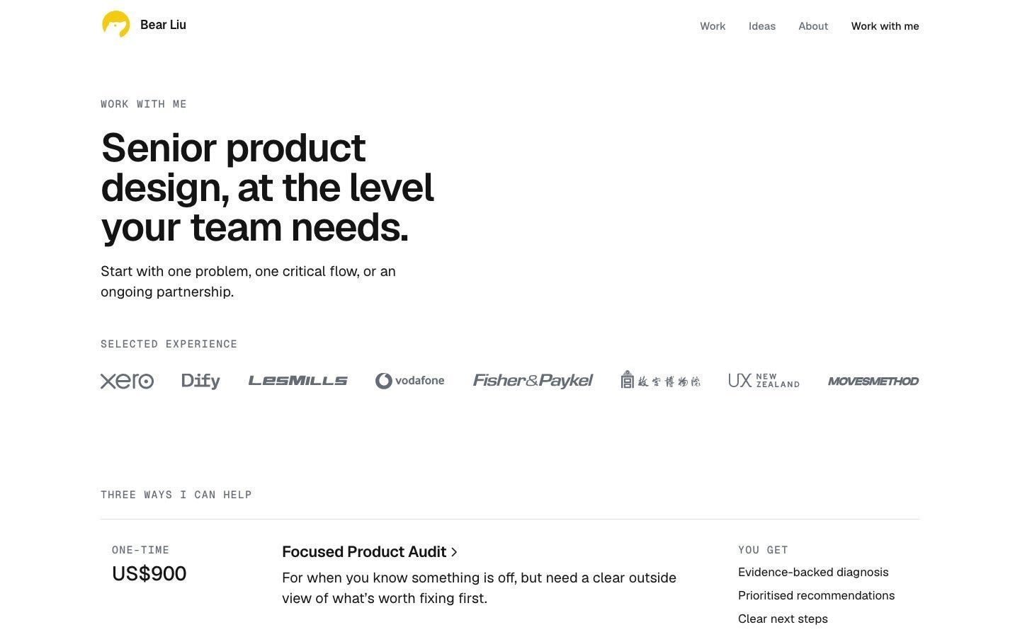
And I brought the offer and booking step together on a “Work with me” page, where someone could understand the options before booking a 15-minute introduction.
That was a change to try. I still needed to find out whether it helped.
The details still mattered
I enjoyed working on the visual side of this version: larger type, a cleaner background, and galleries that could show the work on both desktop and mobile.
I kept some animation, too.
For one JAM card, three phone screens floated independently. When I looked at it, the movement felt messy, especially on a phone. I changed them to sit still, side by side. Other cards kept their movement where it helped show more of the product.
It’s a small change, but it’s the kind of decision I like making. Something can look interesting in isolation and become distracting once it’s part of a page.
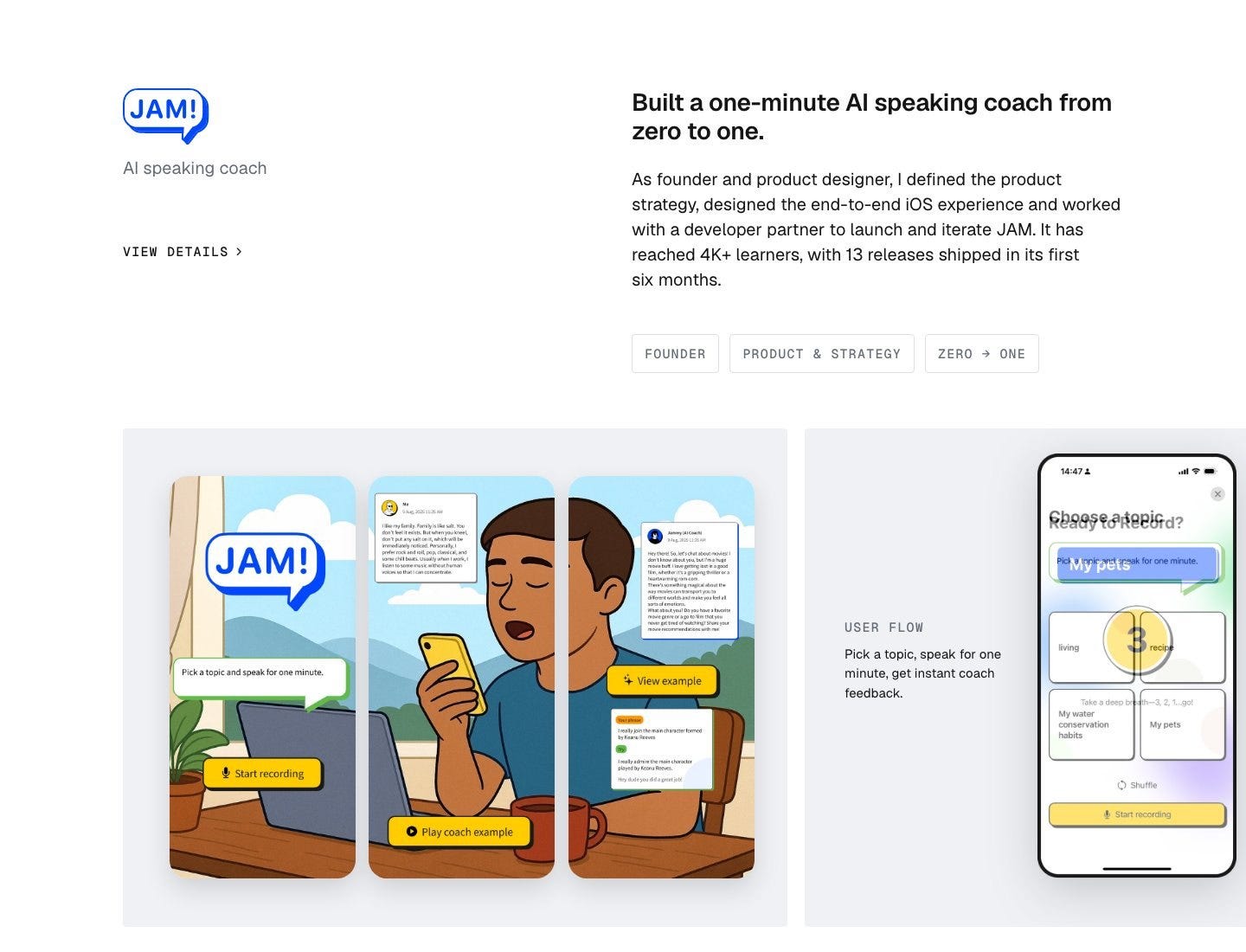
I also kept the “View details” links. Eric had suggested that I could do without separate case study pages. The finished version still lets people read further.
MovesMethod was one I wanted to keep in detail. I’d written the case study just after the project finished, while all the interesting details were still fresh. It showed a more traditional design process, including how I worked alongside a fully remote team.
That felt worth keeping for someone who wanted to understand how I worked beyond the screens on the homepage.
A conversation started
On October 16, someone hiring for a startup emailed after finding my site.
He specifically mentioned two things: JAM reaching more than 4,000 learners, and Xero’s guided setup reaching every new install.
On our call, he also said he liked the website.
I was pleased. Someone had read the work, picked out things that mattered to them, and wanted to talk.
But there was a mismatch. They were hiring for a full-time, on-site role. That wasn’t the way I wanted to work, so I suggested a focused audit that could run alongside their hiring.
I sent a brief and followed up. Nothing further came of it. But I was still happy that the website had done the job I wanted it to do: help someone understand my work and start a conversation.
Whether we were a good fit was something we could work out from there. Every enquiry won’t become a project. Having something useful to talk about was a good start.
What I couldn’t measure yet
When I checked the analytics on October 14, the site had received 632 visitors and 1,386 page views over the previous 30 days. The “Work with me” page had 42 views.
But the booking events weren’t being recorded. I couldn’t follow that path through to completed bookings in the analytics.
I’d spent time thinking about how to help someone take the next step, and hadn’t finished measuring that step myself.
The reporting window also covered both sides of the redesign. Those numbers weren’t a clean before-and-after comparison.
For now, the most useful evidence was specific: what people noticed, what they asked about, and whether the conversation matched the work I wanted to do.
Still working on it
An earlier client had taught me something similar. I’d assumed he’d found me through my content. When I finally asked, he said he’d searched LinkedIn for an iOS designer and shortlisted around eight people.
This was before I had the website I have now. My profile got me into the conversation. The product audit I did afterwards helped him decide to work with me, because he could see my thinking and communication on his own product.
I keep that in mind when I look at this website now. It has a useful job to do, but there’s still a lot we can only learn once we start talking.
Eric reminded me that looking at the audience, clarifying the offer and making the next step easier was work I’d do for a startup.
Doing it for myself took three versions, some uncomfortable feedback, and quite a few small adjustments.
I’m happier with where it is now. I also doubt this is the last version.
Try this on your own site
Pick one person you’d like to work with. Imagine the problem that brought them to your homepage.
Can they understand what you could help with, find a relevant example, and see what happens next?
Then, the next time someone contacts you, ask what they actually looked at. I’ve learned that my own story about how people find me can be quite different from theirs.
And give yourself a reason to come back to the site every couple of months. It doesn’t need a redesign each time. Even if the layout stays the same, you can add a recent project so the work reflects what you’re doing now.
A case study doesn’t have to become a huge undertaking, either. Finish something, write down what you tried, what changed, and what you learned. If there’s an outcome you can share, include it.
This article is a case study, too. I’d like to do more of these while the details are still fresh, rather than wait until my portfolio is two years out of date again.
Where to next
This issue also has a video version:
You can explore the website at bearliu.com.
Has someone ever told you why they contacted you, and surprised you with the answer? Hit reply and tell me.
Thanks for reading!
Bear
Hello, I’m Bear.
I’m a product designer in Auckland, New Zealand. Most of my work is as a Fractional Design Partner, which usually means being the design lead a small team cannot yet hire full time.
Design Decisions is where I take one product apart each week and write up the decisions behind it. I make videos and record a bilingual podcast for much the same reason. I like working things out in the open.
bearliu.com · the full teardown library, and what I do for teams
hi@bearliu.com · the old fashioned way, and I read every reply
linkedin.com/in/bearliu · where most of my English writing goes first
youtube.com/@Bearliu · a video is worth a thousand words
x.com/bearliu · shorter thoughts, as they happen