

It is August already, which in AI time feels like it should be next year.
What strikes me lately is how much has not moved. I started drawing again this month, something I did constantly as a teenager and then put down for years. Picking it back up, almost none of it needed relearning. The tools around it have changed completely. The thing itself has not.
That gap is what this issue is about. Some products are built to be noticed. Others are built to keep working while you forget they are there. We tend to grade both with the same ruler.
Apple Health ships on every iPhone. It sits at a 3.0 rating, and that number grades it as a product people chose. Almost nobody chose it. You bought a phone, and it was already there.
Nobody downloads Apple Health
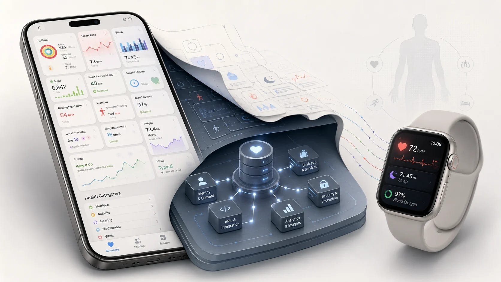
Most of what I take apart is something people actively went and got. Apple Health is unusual. Buy an iPhone and it is already installed. Start wearing a Watch and it quietly begins collecting steps, heart rate, sleep and workouts in the background.
It sits closer to Settings or Contacts than to Fitbit. We do not open those because they are exciting. We expect them to be reliable, and to be there when we need them.
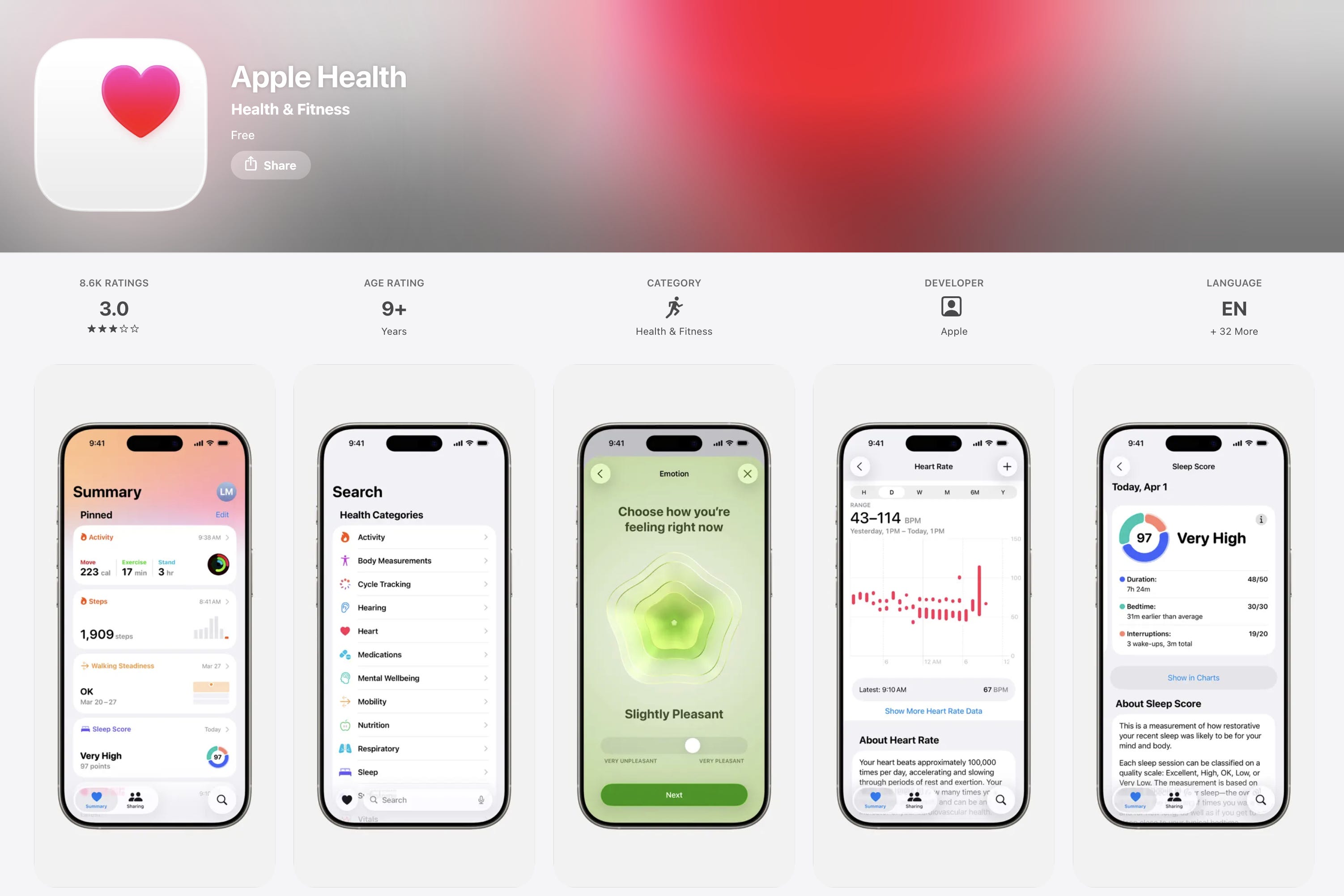
People still judge it against Fitbit and Whoop. Open Fitbit and you get a sleep score, recovery information and a suggested action for today. Open Apple Health and you get a Summary page of pinned metrics and trends, then a Browse tab covering activity, body measurements, hearing, heart, medications, nutrition, sleep, symptoms and vital signs.
The usual complaint is that there are too many categories. That is not quite the problem. Those categories run on three different logics at the same time.
Heart, respiratory and hearing are body systems. Activity, sleep and nutrition are behaviours. Symptoms, medications and vital signs are clinical records. You are being asked to hold three competing maps in your head at once.
Two scorecards
Consumer products are measured by engagement, retention and time spent. The team wants you back tomorrow, staying a little longer.
Infrastructure is measured by the opposite. We do not open cloud backup each morning to check it still works. We do not turn on a tap to admire the plumbing. Infrastructure earns its keep by being stable, trustworthy and unobtrusive, and most of the time you should barely notice it.
Apple Health was built to the second scorecard and is being graded on the first.
It has to hold more than 150 kinds of health data arriving from the iPhone, the Watch, third-party devices, fitness apps, manual entry and medical institutions, all funnelling into HealthKit on the device. That is what buys the compatibility. A hospital record, a heart-rate reading from a Watch and a weight you typed in yourself can all live in the same place.
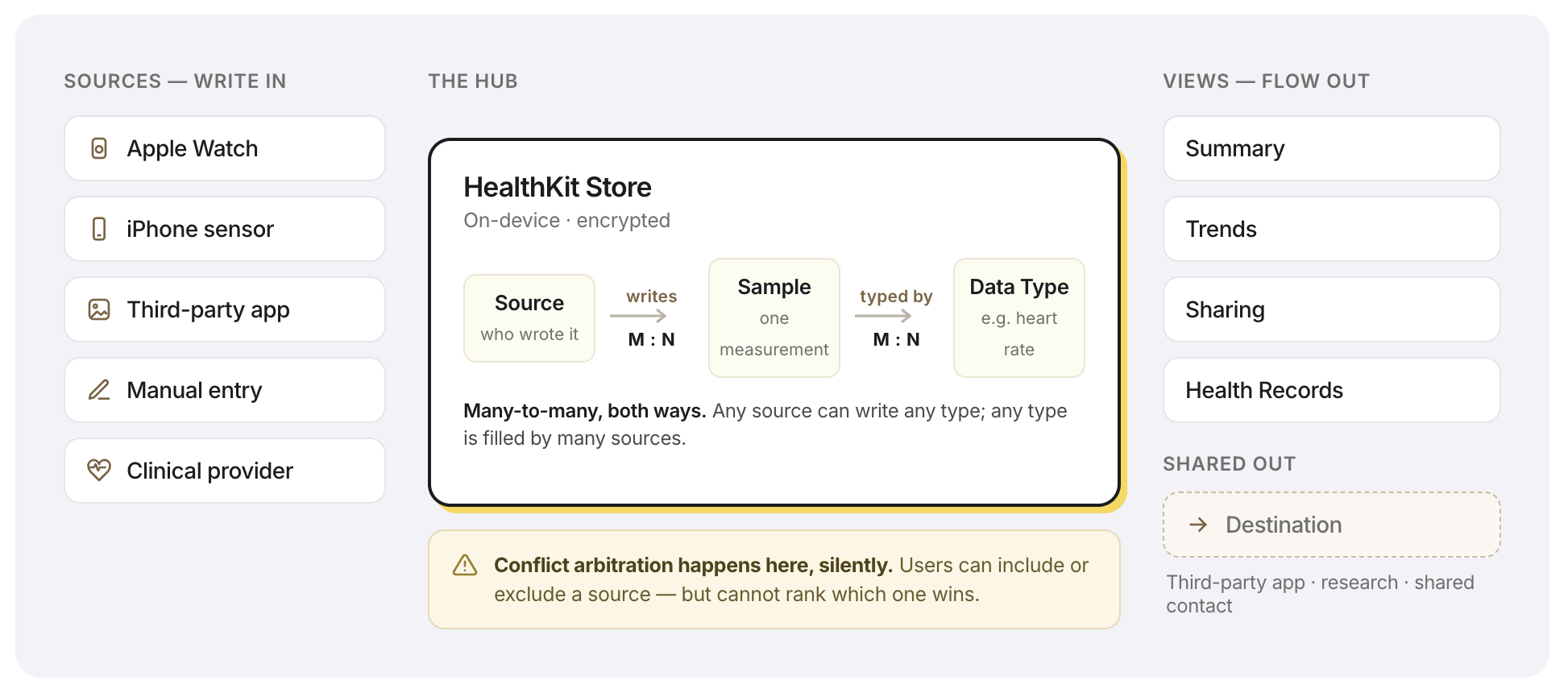
The cost is that it cannot give you Fitbit’s tidy, composed dashboard. Most of Fitbit’s data comes from Fitbit hardware, so Fitbit gets to decide what matters and in what order it appears. Apple Health has to stay neutral. It cannot organise the whole experience around one device, one goal or one idea of wellbeing.
So the capability that makes Apple Health valuable is also what produces its most visible usability problem. Sometimes an interface is simply the structure underneath becoming visible.
Two notes that sharpened this
You are probably not the target user. I watched the new Mario film with my daughter and thought it was loud, shallow and basically plotless. IMDB agreed with me. Then I caught the mismatch: the audience is six to fourteen year olds, and very few of them leave reviews.
The people buying tickets were exhausted parents whose kid would not stop asking. Box office and critic scores have almost nothing to do with each other when your buyer is a child and your decision-maker is a tired adult. Founders in their forties building for Gen Z make the same error with their own taste.
The layer underneath stays invisible until it fails. Roughly 70 to 80 per cent of daily work already happens inside a browser, and almost nobody treats the browser as a product decision. We spend our energy choosing between apps and ignore the layer all of them run on. Infrastructure has that problem permanently. It gets noticed on the day it breaks and taken for granted every other day.
Try this on your own product
Which scorecard is your product actually built for, and which one are you being graded on? When those differ, the gap shows up in your reviews long before it shows up in your revenue.
Then the harder question. Who is leaving your reviews, and are they the same people who get the value? If they are not, you may be tuning the product for an audience that never had to live with your decisions.
Where to next
The full Apple Health teardown is on the site, including the two design cracks I do think are real and why most companies should not copy this kind of restraint: bearliu.com/blog/apple-health-infrastructure-by-design
If something you are building is being measured with the wrong scorecard, hit reply and tell me which one. I read everything that comes back.