

Alongside client work this year I have been going back to the design fundamentals I never took seriously enough. Mostly the classics, read properly this time rather than skimmed.
I just finished 100 Things Every Designer Needs to Know About People. It is old by internet standards and almost all of it still holds. Most of it is not about screens at all. It is about attention, memory, and how much a person can actually hold at once.
That turned out to be useful for this issue, which is about a product running straight into those limits.
Raycast is one of the smoothest tools on macOS. Two keystrokes carry the whole product. Enter runs the main action, Cmd+K shows everything else you could do with the thing in front of you. Learn that once and you can operate more than two thousand extensions.
Then AI arrived, and the same two keystrokes started to look like a ceiling.
What have you been reading lately? Hit reply if something has stayed with you. I am always after the next one.

Two keystrokes, and where they stop working
Open Raycast and type three letters. A list appears. Enter runs the top result, Cmd+K opens the other things you could do with it. Launching an app, finding a file, running an extension a stranger wrote, it is all the same rule.
That is why 2,500 extensions do not feel like 2,500 things to learn. You learn one grammar, and every extension after that is nearly free.
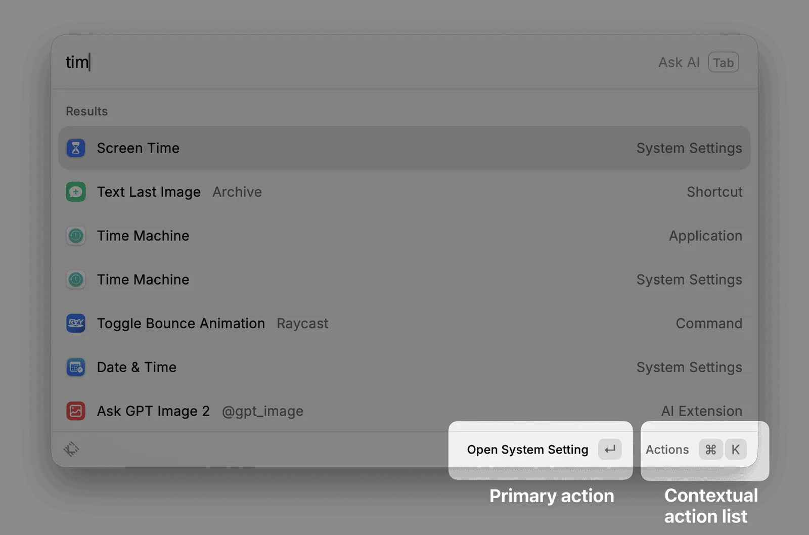
I have turned this into a check I now run on other products. What is the user’s main action? When they need more choices, what do they reach for? Does that rule cover every feature? Then go looking for the place the rule stops holding, because that place is usually the ceiling of the product’s structure.
On system tools and quick actions, Raycast passes almost perfectly. It stops holding at AI.
The command bar has one rhythm. Appear, act, disappear. You summon it, type, run something, and it is gone within seconds.
AI has a different rhythm. Persist, iterate, build up context. The first answer is a starting point. You add a file, change the tone, compare a few options, keep going from what came before.
So Raycast now has two doors. Quick AI in the command bar for a single answer, and AI Chat in its own window for a conversation. Before you ask anything, you have to decide which one you are in.
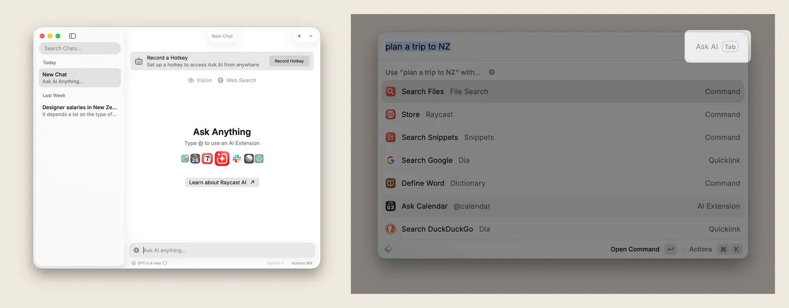
It looks like a tiny choice. It also undoes the thing Raycast was best at. The product that removed the cost of operating has quietly put one back.
Glaze is the receipt
In March, Raycast shipped Glaze, which generates native desktop apps by talking to an AI. The interesting part is not what it does. It is where they put it.
Glaze is not inside the command bar. It is a separate product, with its own engineering, its own brand and its own budget.
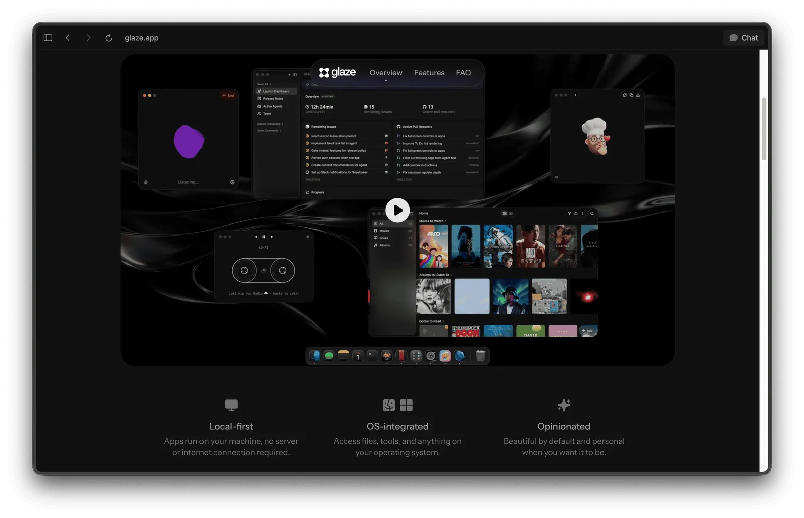
A standalone product costs far more than a strategy statement. When a company is willing to pay that, it is telling you something about the old product that no press release will. The team already knows the command bar cannot hold what they want AI to do.
Worth borrowing next time a company ships a new surface. Put the vision aside and ask a narrower question. What could the old product not do, that forced them to build a new one? The answer usually sits closer to the real strategy than the positioning does.
Two notes that sharpened this
The model is rarely the problem. Most poor chat experiences fail on interaction design, not intelligence. Three layers decide it: input, where an empty text box asks too much of someone who cannot yet articulate what they want; output, where plain prose is usually the wrong format; and refinement, where teams make people re-describe an edit in a sentence instead of handing them a slider or letting them click the part they want changed. AI bolted on as a feature behaves differently from AI woven into the work, and users feel that difference long before they can name it.
The window for new patterns is closing. We are in the short phase where the limits of the old interaction model are obvious and the new one has not settled. Phases like that do not last. Teams paying attention now get to shape what these interactions become, and everyone else inherits whatever the large platforms standardise first.
Try this on your own product
Three questions, in order.
What is the main action in your product, and what do people reach for when they need more than that? Does the rule still hold at the edges, or is there a feature that already needs its own window? And if there is, is that feature the one you charge for?
Raycast’s answer to the last one is uncomfortable. The free tier already covers most of what people use daily. The clearest reason to pay is AI, which is the part that fits the original design least.
Where to next
The full Raycast teardown is on the site, with the screens, the extension ecosystem numbers and what they suggest about the moat: bearliu.com/blog/raycast-the-interaction-model
If you are adding AI to something that was not designed around it, hit reply and tell me where it stopped fitting. That is the part I find most useful to hear.