

I love my Traveler’s Notebook. My first one was not even from the original brand, and it was still a good notebook: a decent cover, and easy to carry everywhere.
I have written a lot in it. Over two years I have logged around 500 journal entries and gone through more than a dozen inserts.
Somewhere along the way I started noticing the paper, the pens and the inks. Small details matter when you write by hand. The weight of a pen changes how comfortable you are, how long you keep going and how carefully you write. Fascinating, isn’t it?
None of that shows at a glance. It only shows after a few hundred pages.
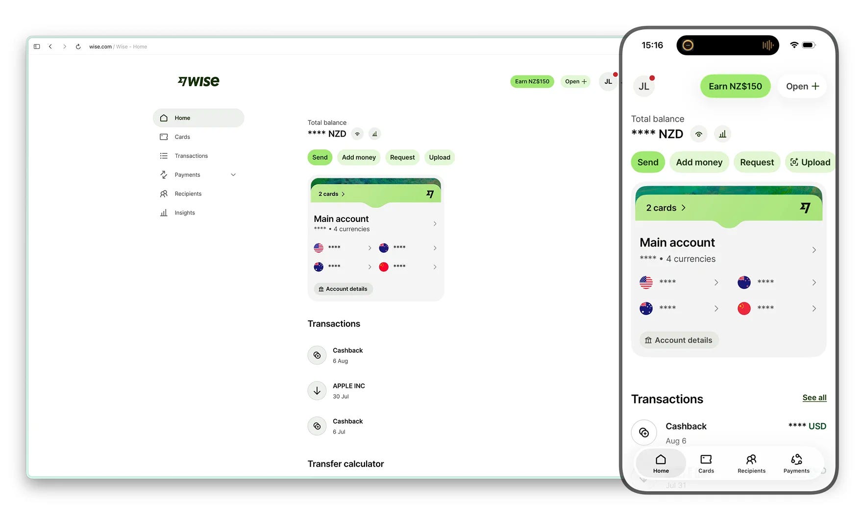
Wise’s website and app look almost identical too. The interesting part is the handful of places where they do not.
Matching screens are what the system outputs
At a lot of companies the website, the iOS app and the Android app belong to different teams. Give it a year and the same feature has quietly become three features. A button moves on one platform and stays put on another. The web gets a new flow while mobile is still running the version from six months ago. Then somebody schedules a meeting to bring it all back into line.
Wise did not solve that with discipline. It solved it with plumbing. Much of the interface comes out of a shared component library, and some screens have their structure defined on the server.
Think about a chain of coffee shops. If every store designs its own menu, picks its own cup sizes and invents its own way of taking orders, keeping them consistent becomes somebody’s full time job. If the menu, the cups and the till are designed centrally, the stores feel the same without anyone managing it.
Wise is the second kind. So when I see two near identical screens now, I read them as output rather than achievement. Matching is what that system produces when nobody intervenes.
The differences are where somebody made a decision
There are not many of them. They are worth more than the hundred screens that agree.
Some are easy to account for. A phone has a camera, so QR based payments such as Alipay make sense there and are absent from the web. Businesses can upload a CSV and pay hundreds of recipients at once, and that lives only on the website. Someone paying several hundred suppliers is sitting at a desk. Rebuilding that for a phone to keep the platforms level would buy very little.
Then there is Insights, the spending analysis feature. The website gives it a more prominent position. The app buries it deeper, then hands you finer control, including the ability to drop a single transaction out of it. The platform that promotes the feature harder gives you less say over it.
That reads like a house renovated a few times. Every room works. You can still feel that the decisions were made in different years by people who were not talking to each other.
The one that stayed with me is smaller. On the same phone, signing in through a browser and signing in through the app can be treated by Wise’s security system as two separate devices. You see one phone. The system sees two doors.
Two interfaces can look identical while the systems underneath them make different calls about risk.
The best decision Wise made sits before the signup
Open the Wise homepage and there is no hero image and no wall of company statistics. There is a calculator that works.
Put in NZ$1,000, convert to Australian dollars, and you get the rate, the fee, the amount landing in the other account and when it is expected to arrive. Open the fee and it splits into what Wise takes and what the payment method takes. There is a comparison table underneath. On the transfer I ran, Wise showed the recipient getting around A$830, against roughly A$813 at Westpac and about A$788 at PayPal.
Wise never has to write a headline claiming it is cheaper. The numbers have done that.
Then comes the part I keep returning to. Press Send money and you do not get another marketing page. You get the registration form. The calculator is not a tool sitting beside the signup. It is the first screen of it.
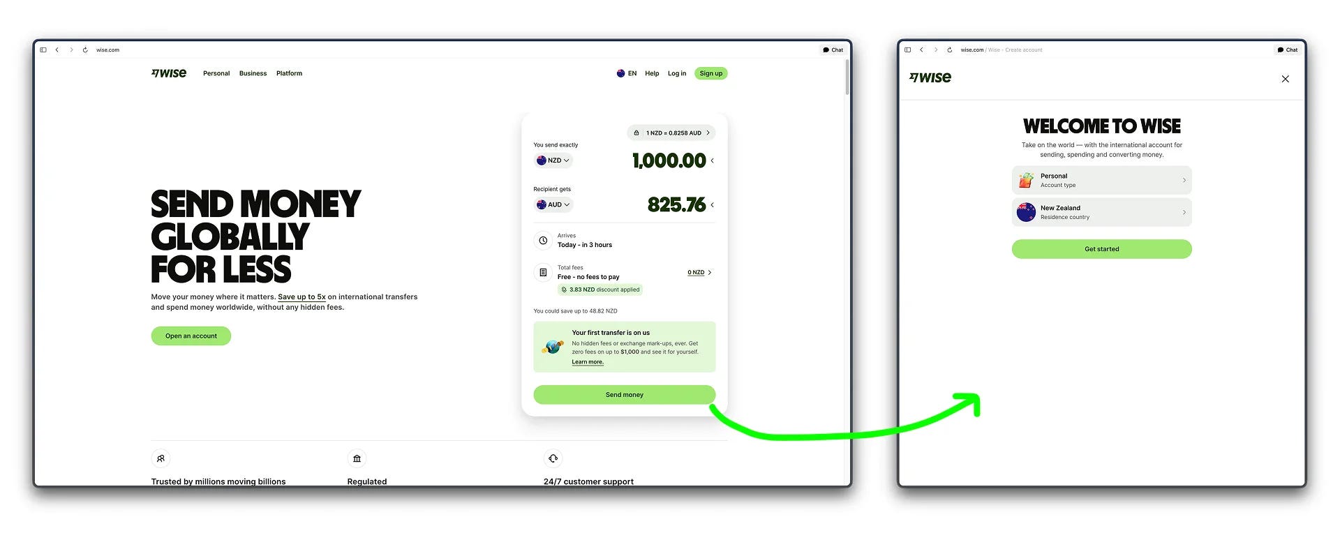
So the trade-off is not consistency against inconsistency. Consistency makes a product easier to use, and Wise buys it cheaply because it paid for the infrastructure years ago. What actually earns the account is a prospect verifying the main claim themselves, before being asked for anything.
Most products state the claim first and leave you to check it later. Wise runs that order backwards.
Two notes that sharpened this
The real source of a product is not the thing you are looking at. A colleague reframed this for me in a meeting a while back. The source of truth for a software project is no longer the codebase. That is compiled output. The real source is the intent document, the problem framing, the scope somebody defined.
Matching screens are compiled output too. If you want to know why two platforms agree, do not read the screens. Read whatever generates them.
A hundred small decisions make or break an interface, not one brilliant idea. The Vercel design team published a set of web interface guidelines that reads like a quiet checklist of things most teams skip. Tap targets. Input font sizes. Alignment systems.
One of them: mobile input fields need to be 16px or larger, because iOS Safari will otherwise zoom and pan the viewport. That is not taste. It is a constraint with a consequence attached. The decisions worth finding are usually that small, and there are usually a hundred of them.
Try this on your own product
Open your web and mobile versions side by side and list every place they diverge. For each one, name the decision and the person who made it.
The ones you can name are design. The ones nobody can account for are drift, and drift is cheaper to fix now than after somebody builds on top of it.
Then find the moment a prospective customer could verify your main claim without your help. If that moment sits behind a signup, see how far forward it can move.
Also from me
A few other things I have written, outside the teardown.
Two people, two years, one hour of game
Two people. Two years. No dialogue, no text, no tutorial. Just hand-drawn art and sound design.
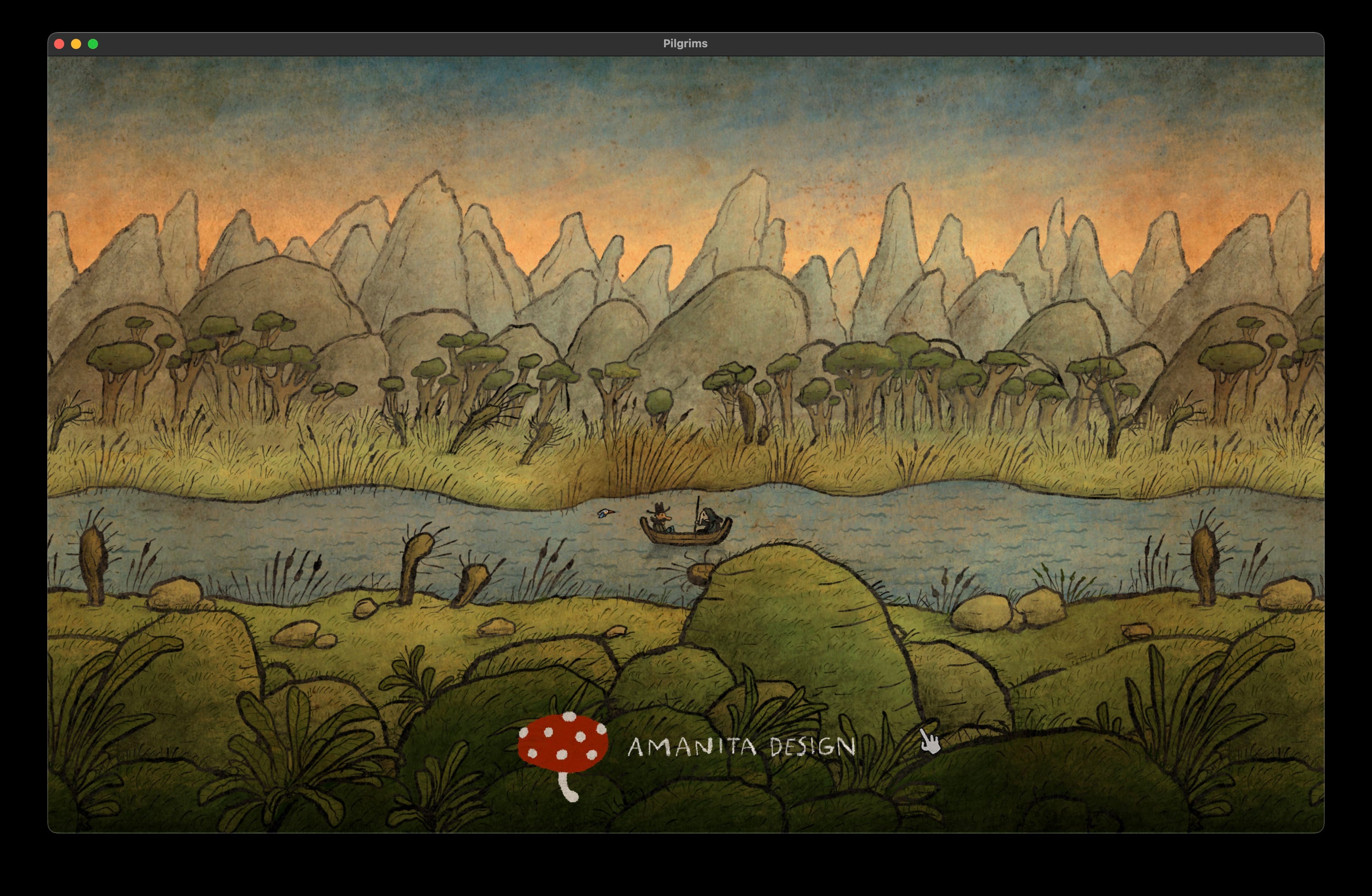
I finished Pilgrims this week, a short puzzle game by Amanita Design (the studio behind Machinarium and Botanicula). It took just over an hour to complete. The studio spent two years making it.
That ratio stopped me.
Amanita has always built games that cross language and culture entirely through visuals. No localisation needed. No copy deck. The craft carries everything. Pilgrims does the same, reimagining classic fairy tale archetypes (the traveller, the farmer, the devil, the king) through illustration alone.
Here is the thing that stuck with me as a product person: the game is short by design, not by accident. The constraint is the point. They chose depth over length, and the result is something with a clear aesthetic identity that a large studio would likely have bloated into a 20-hour open world.
Which raises an uncomfortable question for anyone building products right now: how much of what we ship is longer, heavier, or more complex than it needs to be, simply because we had the resources to make it that way?
The AI angle is real too. A small team with genuine creative direction and aesthetic taste could produce something like Pilgrims today at a fraction of the production cost. Not because AI replaces craft, but because it removes the bottlenecks that used to require headcount. The constraint shifts from resources to judgement.
That is the harder thing to develop.
If you are building a product with a small team right now, the question probably is not “how do we do more?” It is “what would we cut if we only had time to get one thing exactly right?”
It was Bluetooth
Arrived at the gym this morning to find my phone couldn’t open the door. Tried everything. Restarted the app, checked my membership, nearly convinced myself the system had dropped me.
Got home and noticed my fitness tracker had stopped syncing with Google Health too. Two separate failures, both happening at once. Something must be seriously wrong.
It was Bluetooth. I’d turned it off the night before and forgotten.
I build digital products for a living. I think about user flows and error states for fun. And I stood in a car park for five minutes troubleshooting two apps that were working perfectly fine.
The lesson I keep relearning: when something breaks, check the simplest thing first. Not because you’re not smart enough to find the complex problem. Because the simple one is usually it.
The $40 clip, and the wrong question
I used to ask the wrong question when buying something expensive.
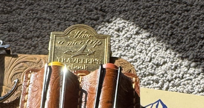
Last week I nearly talked myself out of a $40 notebook clip. Forty dollars. For a clip. My internal monologue went straight to: how can this possibly be worth that?
But that is not really the question, is it.
The actual question is: am I worth using something this good?
I answered yes, bought the clip, felt zero guilt about it.
It is a small reframe but it changes where the scrutiny lands. Instead of defending the object, you are deciding something about yourself. And once you have made that call, the $40 stops feeling like a leak and starts feeling like a standard.
Anyway. The clip is excellent.
Where to next
The full Wise teardown is on the site, including what happens to a brand built on transparency when an account gets frozen: bearliu.com/blog/wise-consistency-is-the-cheap-part
Where do your two platforms disagree, and can anyone say why? Hit reply and tell me. I read everything that comes back.

Hello, I’m Bear.
I’m a product designer in Auckland, New Zealand. Most of my work is as a Fractional Design Partner, which usually means being the design lead a small team cannot yet hire full time.
Design Decisions is where I take one product apart each week and write up the decisions behind it. I make videos and record a bilingual podcast for much the same reason. I like working things out in the open.
bearliu.com · the full teardown library, and what I do for teams
hi@bearliu.com · the old fashioned way, and I read every reply
linkedin.com/in/bearliu · where most of my English writing goes first
youtube.com/@Bearliu · a video is worth a thousand words
x.com/bearliu · shorter thoughts, as they happen