

A while ago I started applying for a US visitor visa, for a possible family trip. We have since postponed it. Partly that was the flights, which got ridiculous once fuel prices went up.
The other part was the application itself. I picked the wrong location when I submitted it, and the system would not let me go any further. It would not let me start again with a new account either. It was frustrating enough that I simply walked away.
Maybe I will go back once flights are back to normal. That probably depends on whether my wife chases me about it.
The mistake itself was small. What made me leave was a system that offered no way forward and no explanation.
Last week was about where Wise’s website and app diverge. This issue is about the screens nobody puts in a launch deck: the ones where the product cannot give you a full answer.
Price is explained. Time is not.
Wise is very good at telling you what a transfer costs. It is much quieter about when the money turns up.
I ran two US dollar transfers on the same afternoon. One was estimated to arrive in about 30 minutes. The other would not land until the following day. Same product, same afternoon, and no explanation for why one route was so much faster.
That gap matters because anyone making a transfer is buying two things. One is price. The other is certainty.
Sending $50 to a friend, a few extra hours cost you nothing. Paying rent, settling an invoice, paying a supplier before a deadline, and knowing when it lands is worth more than saving a few dollars. Wise has made the first thing completely transparent. The second is still mostly a black box.
What do you do when you are not allowed to explain?
This gets much sharper when an account is frozen.
Wise has an extremely high rating on Google Play. The negative reviews cluster around one experience: an account is suddenly restricted, the customer does not understand why, support replies read as generic, and there is no obvious next step.
There is an important complication. When financial institutions suspect fraud or money laundering, they may be legally prevented from warning the customer in advance, and in some situations, once certain reports have been filed, from explaining what triggered the review at all. So some of that silence is not a product decision. It is regulation.
Which leaves a more interesting question. If your product promises to explain clearly what is happening, what do you do when the law stops you explaining?
Wise still has room here. There is little public detail on what an account review looks like, what a customer can realistically do, how long the stages take, or what comes next. There is also nothing separating two very different situations: we are legally unable to tell you, and we have not got to your case yet.
From the customer’s side, both look the same. Silence. And people handed an information vacuum will fill it themselves, rarely with the optimistic version.
Think about a delayed flight. Everyone would rather leave on time. Once that is gone, knowing why, how long, and what happens next beats staring at a red DELAYED label that never changes. Transparency does not require you to reveal everything. The hard part is explaining what happens next when you cannot.
Freezing a card takes seconds, and that changes what it is for
Card management is where the two platforms part company again.
On the website you get a list of cards, each with its last four digits and status. You pick one, open it, then act. Slightly old fashioned, and completely clear.
The app is more compact. A carousel sits at the top and the actions sit underneath: Show PIN, Card details, Freeze card. Swipe to another card and those actions now apply to the new one, without the interface making that relationship obvious. With one card it does not matter. With several it does, and one of those buttons switches off your ability to pay.
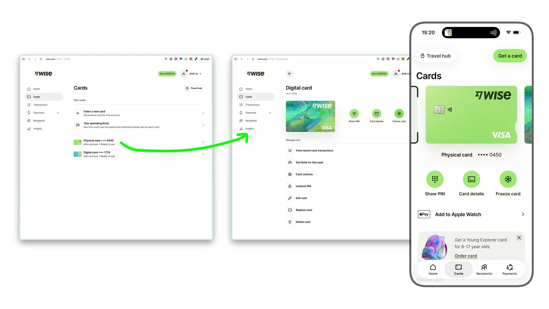
So I tried it. The card went grey and the button became Unfreeze. Tapped again, and the card was live. The whole thing took a few seconds.
Most of us arrive at a button like that carrying assumptions from traditional banking. Will I have to call support? Verify my identity again? Wait hours to get it back? Wise made the answer to all of that no.
That produces something the feature was probably not designed for. When reversing an action costs nothing, people stop treating it as an emergency. Some customers keep the card frozen most of the time, unfreeze it to pay, then freeze it again.
And if somebody is doing that two hundred times a year, making the button easy is no longer the interesting opportunity. Automation is. Freeze above a certain amount, freeze outside a region, or let people write their own conditions.
Designers argued about the green. Customers argued about their money.
One more piece worth sitting with. In 2023 Wise moved off the familiar fintech blue and adopted a very bright green, a new typeface and a much more expressive visual language. The product did not work differently. The price did not change.

In a Hacker News thread about the redesign, a surprising number of designers reached for a word that does not usually come up about colour palettes. Trust. A company handling people’s money should not look this playful.
The business data makes that hard to defend. Wise now has around 19 million active customers. The share of personal customers using more than one Wise product rose from roughly 44 per cent around the rebrand to close to 50 per cent. The app rating sits around 4.8. And when customers do complain, they complain about frozen accounts, support, and when the money will arrive. Almost nobody leaves a one star review because the app is green.
Different audiences read different signals. Designers read typography and visual language, because that is what we look at all day. Most customers read price, speed, and whatever has previously gone wrong for them. That is the whole argument in one line: trust is not decided on the screens we like showing each other.
Two notes that sharpened this
Withholding only works when you have already promised the thing. I have been playing Control, which stretches progressive disclosure across ten or more hours. New abilities arrive deep into the game and the map you thought you understood opens up again.
It lands because the withholding is architectural rather than arbitrary. The places you cannot reach are visible from the start, so you register the gap before it gets filled. Hide something that was never hinted at and the reveal just feels like you forgot to build it sooner. A frozen account is the same shape. Silence is survivable if the customer has already been shown what the process looks like.
When the cost of an action collapses, people do it far more, and something else starts compounding. Pilots do not log simulator hours because each flight produces anything useful. They log them because the reflex only builds through repetition.
I think about that with AI tooling, where the founders who feel behind are not short on knowledge, they are short on hours. It is the same mechanism as the freeze button. Drop the price of one action low enough and you do not get slightly more of it. You get a different behaviour, and usually a product opportunity nobody scoped.
Try this on your own product
Take your worst case. Account locked, payment declined, order stuck somewhere. Write down what you are genuinely not allowed to say, and separate it from what you simply have not got round to saying.
Customers cannot tell those two apart. Given the choice, they will assume the worse one.
Then pick the heaviest, most alarming action in your product and time how long it takes to undo. If undoing is cheap, watch whether people start using it as a routine instead of an emergency. That is usually where the next feature is hiding.
Also from me
A few other things I have written, outside the teardown.
Slow on purpose is different from slow by default
I picked up a sketchbook five years ago and have filled maybe 400 pages since.
I felt pretty good about that until I came across an artist who filled 500 pages in nine months. Six sketchbooks. Same period I was slowly working through one.
The gap is not really about talent. It is about frequency. He drew every day, roughly, and that repetition made him genuinely expressive in a way I am not yet.
What I did not expect is that realising this felt freeing, not deflating. Because the bottleneck is simple. Not skill, not tools, not the right notebook arriving in the post. Just showing up more often.
Slow is fine. Slow on purpose is different from slow by default.
They redesigned the reporting surface, not the headcount
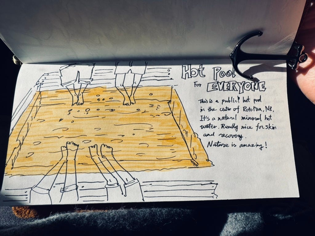
New Zealand’s coastline is thousands of kilometres long. There aren’t enough staff to monitor all of it. So someone made a simple call: put QR codes at key erosion-prone points along the shore.
When a local notices a crack, a slump, or something that looks off, they scan the code, snap a photo, and submit it. The agency gets a timestamped, geotagged report without deploying a single additional staff member.
It’s a textbook crowdsourcing pattern, but what makes it work isn’t the technology. It’s the zero-friction submission path. No app to download. No account to create. No form to hunt for. The action cost is low enough that a curious person on a morning walk will actually do it.
This is the same design problem that shows up constantly in early-stage products. Teams build powerful features, then bury the contribution or feedback path three clicks deep. The result: silence. Not because users don’t care, but because the moment of friction arrived before the moment of motivation passed.
If you’re building anything that depends on user-generated input, whether that’s onboarding feedback, bug reports, feature requests, or community contributions, map the distance between when someone notices something and when they can act on it. That gap is where participation dies.
The coastline team didn’t hire more rangers. They redesigned the reporting surface. That’s the move.
Not every product needs to solve a problem
I had an idea for a small side project last week. Before writing a single line of code, I ran it through a Socratic dialogue with Claude, asking it to pressure-test the concept. Within a few rounds of questioning, it had dismantled nearly every assumption I had about the business model, the target user, and the core problem being solved.
And then I realised: I didn’t actually want to build a product. I just wanted to make something. The same way a kid folds paper into a crane, not because cranes are useful, but because the folding itself is satisfying.
That’s a legitimate reason to build.
We’ve absorbed so much startup orthodoxy that we’ve started treating “does this scale?” as a moral question. Every side project needs a TAM. Every prototype needs a waitlist. Every experiment needs a north star metric. But the first person to draw on a cave wall wasn’t thinking about distribution. They were just compelled to make a mark. And that’s exactly where human creativity separated from everything else.
The Socratic questioning was still worth doing. It cleared the fog and helped me see what I actually wanted, rather than what I thought I was supposed to want. That’s a useful diagnostic move whether you’re building a $5 product or raising a seed round: ask why until you hit something true.
For me, the true thing was small and personal. And that’s fine.

Where to next
The full Wise teardown is on the site, including why the consistency between web and mobile is the cheapest part of the whole thing: bearliu.com/blog/wise-consistency-is-the-cheap-part
What is the screen your product hopes nobody ever sees? Hit reply and tell me. I read everything that comes back.

Hello, I’m Bear.
I’m a product designer in Auckland, New Zealand. Most of my work is as a Fractional Design Partner, which usually means being the design lead a small team cannot yet hire full time.
Design Decisions is where I take one product apart each week and write up the decisions behind it. I make videos and record a bilingual podcast for much the same reason. I like working things out in the open.
bearliu.com · the full teardown library, and what I do for teams
hi@bearliu.com · the old fashioned way, and I read every reply
linkedin.com/in/bearliu · where most of my English writing goes first
youtube.com/@Bearliu · a video is worth a thousand words
x.com/bearliu · shorter thoughts, as they happen